Sakura Chart Guides
Turn data into clear, meaningful charts
Explore chart basics, statistics, Python, and real-world data analysis. Choose a category below to find the guide you need.
Chart basics
Chart basics
Chart types and how to choose
Compare common chart types and learn which one fits your purpose. Read article →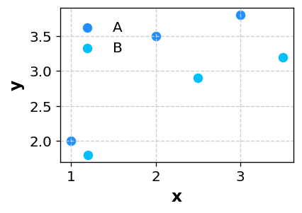
Chart basics
What is a scatter plot?
Learn how scatter plots reveal relationships and correlation between two variables. Read article →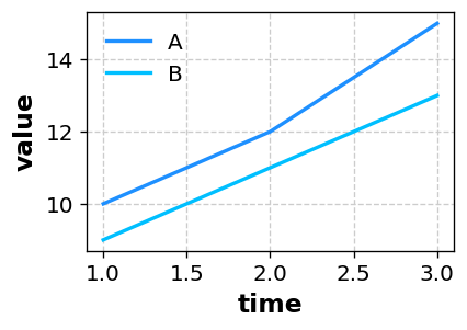
Chart basics
What is a line chart?
Learn how to show change over time and compare multiple series. Read article →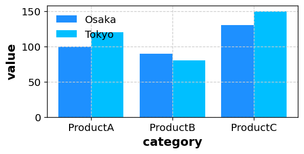
Chart basics
What is a bar chart?
Learn how bar charts compare values across categories. Read article →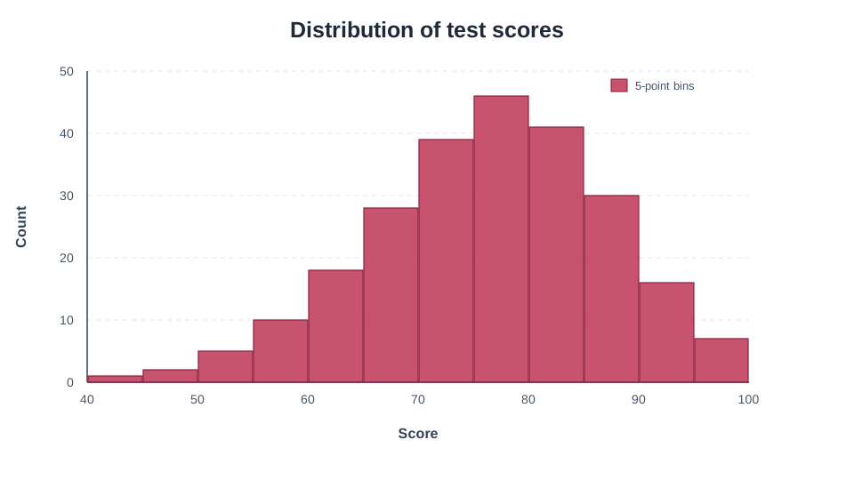
Chart basics
What is a histogram?
Learn to read numeric distributions and choose bins, density, and cumulative settings. Read article →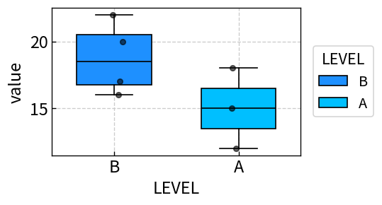
Chart basics
What is a box plot?
Read distributions through medians, quartiles, ranges, and outliers. Read article →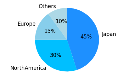
Chart basics
What is a pie chart?
Learn when pie charts work well and how to avoid misleading comparisons. Read article →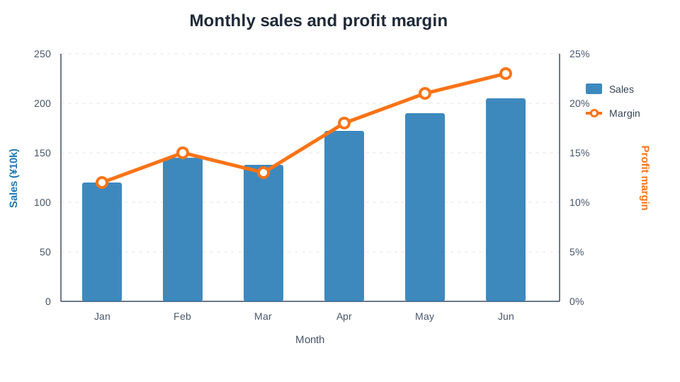
Chart basics
What is a combination chart?
Combine bars, lines, and two axes to compare metrics in one chart. Read article →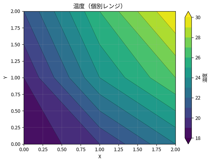
Chart basics
What is a contour plot?
Visualize X-Y-Z data and compare shared and individual color ranges. Read article →Statistics and programming
Statistics
Statistics basics: mean, variance, p-values, and regression
Review the core measures and ideas used in data analysis with formulas and examples. Read article →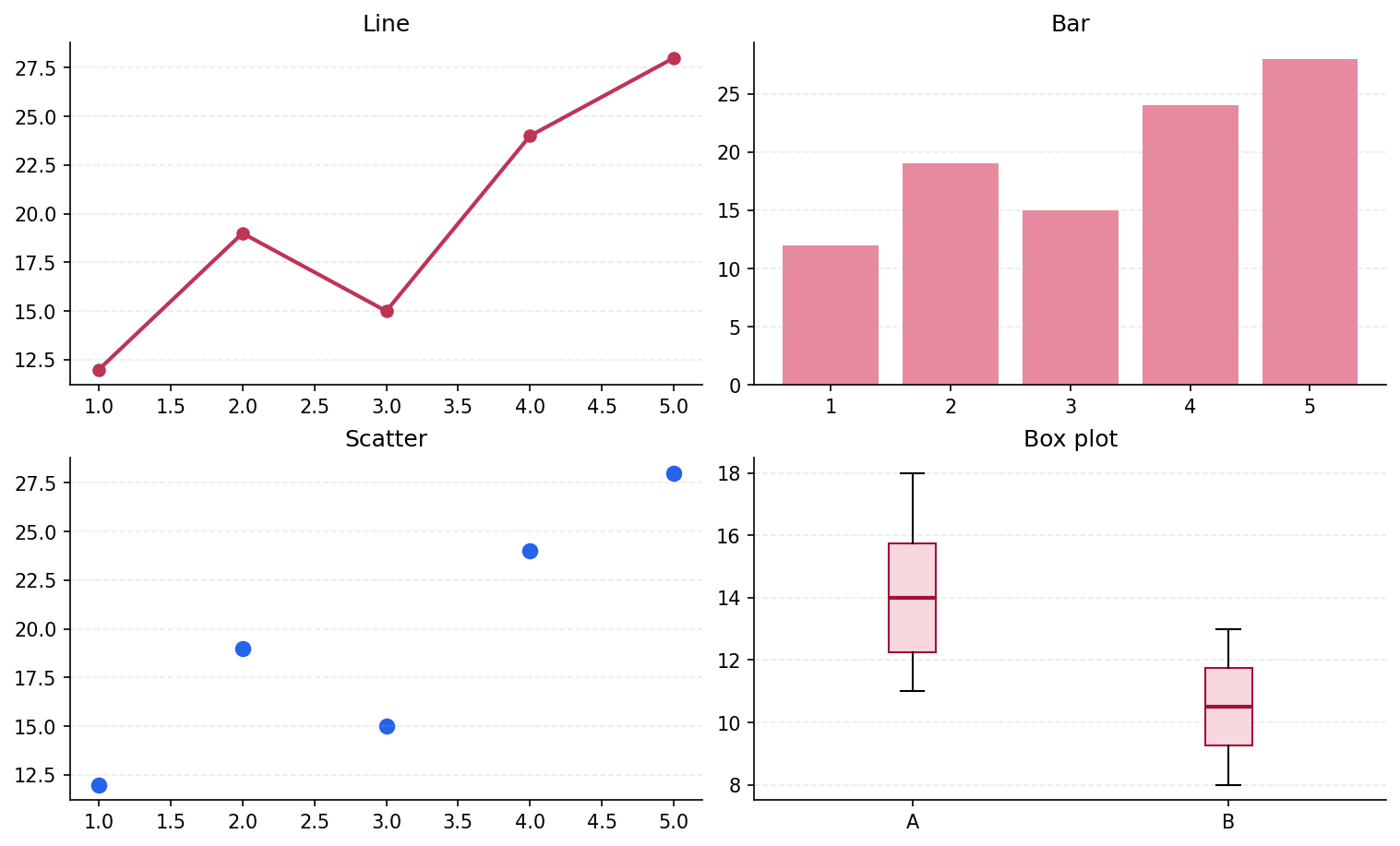
Python
Matplotlib basics: creating charts with Python
Learn the basic Python code for creating, customizing, and saving charts. Read article →Real-world data analysis
Data analysis
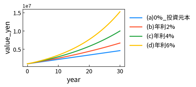
Calculating and charting compound investment returns
Use a geometric-series formula and simulations to compare principal with assumed returns. Read article →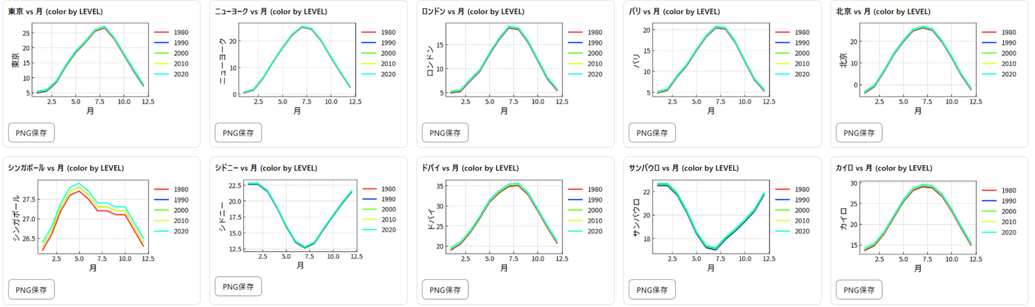
Data analysis
Comparing annual temperatures across 10 cities
Compare temperature trends to reveal regional differences and seasonality. Read article →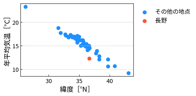
Data analysis
Can latitude predict average temperature?
Compare regression models using latitude, elevation, longitude, and JMA climate normals from 47 locations. Read article →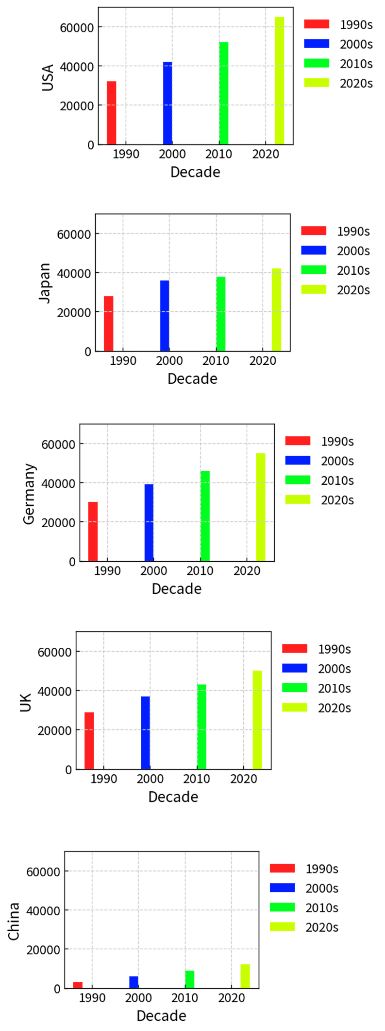
Data analysis
Average income trends by country and decade
Visualize differences in dollar-based income data across countries and decades. Read article →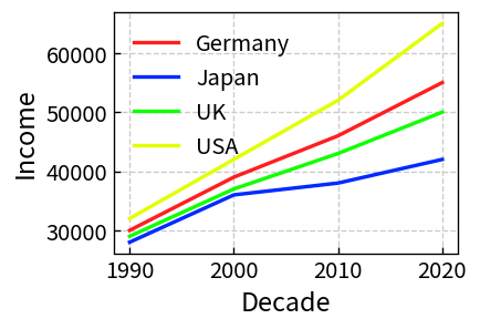
Data analysis
Why does income growth in Japan appear stagnant?
Examine Japanese income data through nominal values, exchange rates, and comparisons. Read article →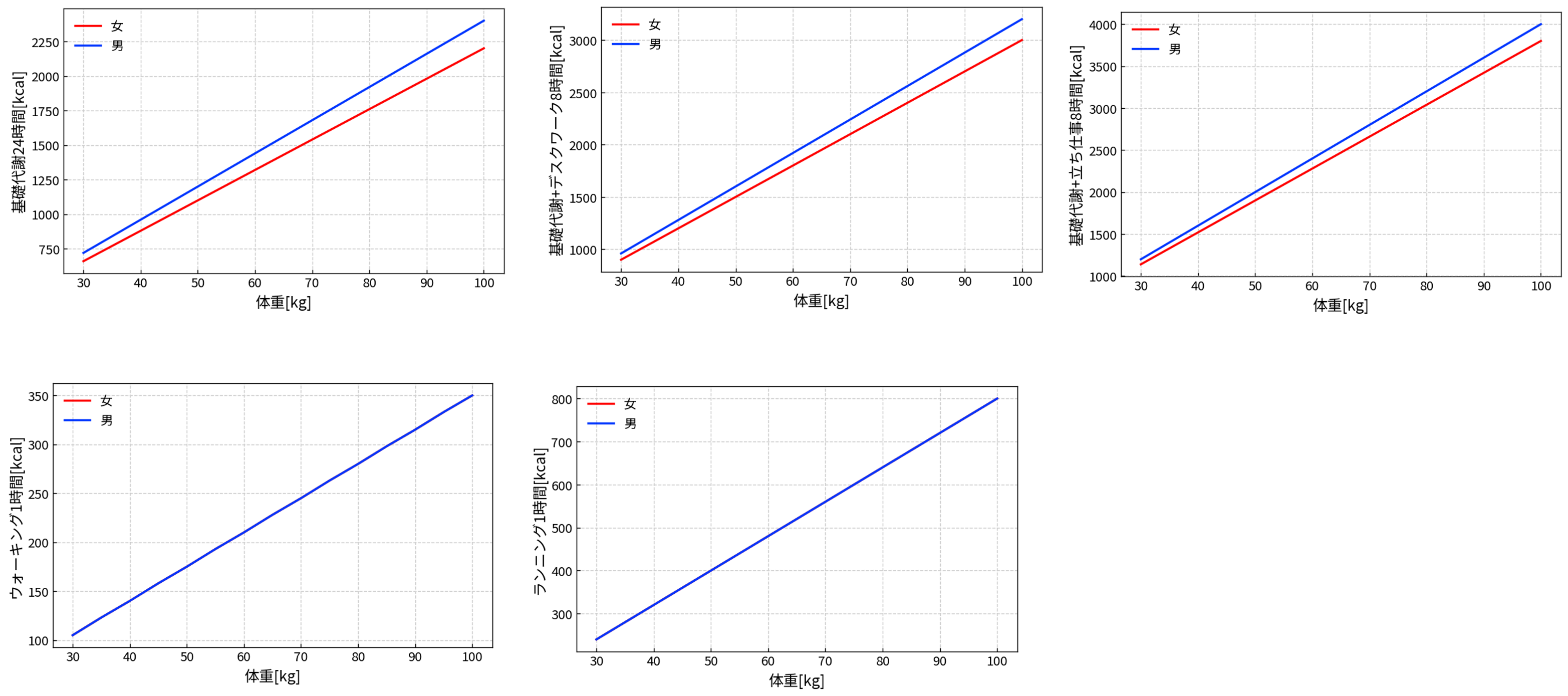
Data analysis
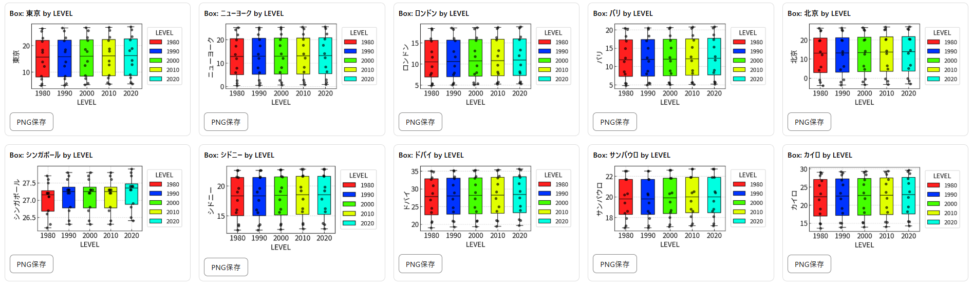
Comparing body weight and calories burned by sex
Use LEVEL coloring and small multiples to make group differences easier to see. Read article →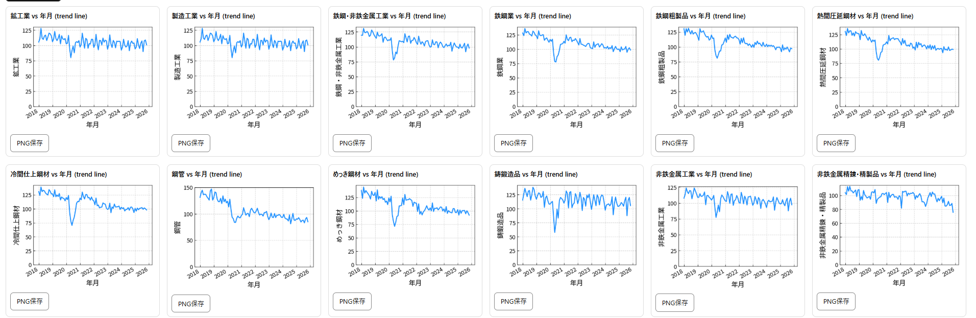
Data analysis
Visualizing the Industrial Production Index by industry
Use Japanese government Excel data to compare industrial trends at a glance. Read article →Science and experiments
Physics
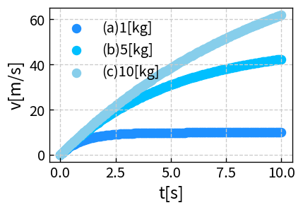
Free fall and air resistance
Compare how falling motion changes with and without air resistance. Read article →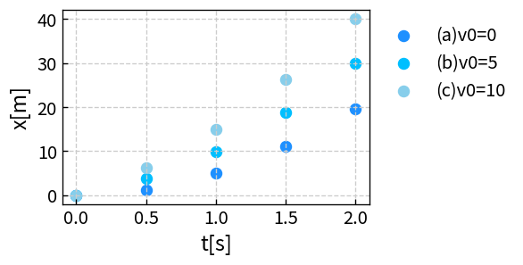
Physics
Free fall with an initial velocity
Visualize changes in position and velocity for different initial speeds. Read article →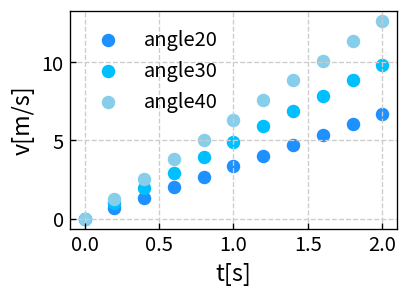
Physics
Speed changes on an inclined plane
Change slope angle and mass to explore how the speed changes. Read article →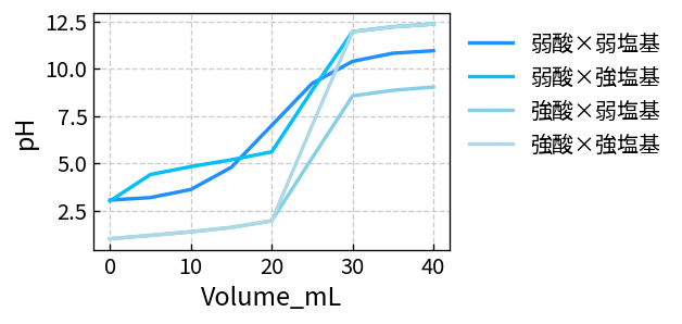
Chemistry
How to create acid-base titration curves
Compare pH changes for different acid-base combinations with titration curves. Read article →Using Sakura Chart
Excel automation
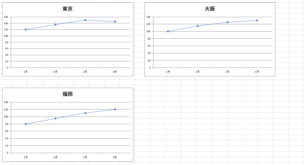
Five ways to create many charts in Excel
Compare copying, templates, VBA, and Office Scripts for producing consistent charts efficiently. Read article →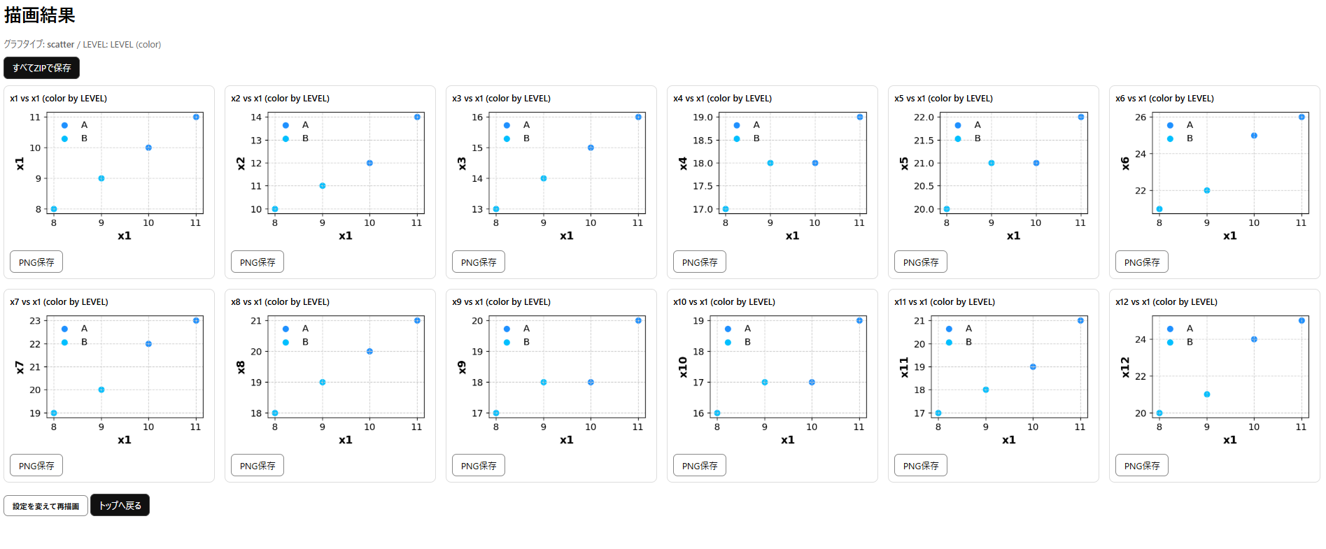
How to use
Excel vs. Sakura Chart
Compare their workflows and strengths to choose the right chart-making approach. Read article →
Coordinate art