Why Does Japan's Income Growth Look Flat?
It is often said that wages in Japan have not increased while incomes elsewhere have. The picture, however, changes with the currency, time period, and statistic being compared. This article uses an illustrative country-by-decade dataset in U.S. dollars to examine that visual impression.
Key Takeaways
- Level: Japan remains at a relatively high income level in the sample.
- Growth: its upward slope appears gentler than those of some comparison countries.
- Presentation: a USD comparison can magnify or reduce gaps as exchange rates change.
Sample Data
The table contains a decade, an income value, and a country. Click below to copy the same dataset used in the Japanese article and paste it into Sakura Chart.
These figures are illustrative and are not official average-income statistics.
Recommended Charts
1. Bar Chart: Compare Levels
Color the bars by decade to compare which country is higher at each point in time. Japan remains in the middle to upper part of this small sample, while the gap in the 2020s becomes visually prominent.
2. Line Chart: Compare Growth
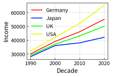
Put decade on the horizontal axis to compare slopes. Japan's line still rises, but its slope is gentler than that of the United States in this constructed dataset.
3. Box Plot: Compare Distributions
A box plot shifts attention from a single mean to the position and spread of a group. With real microdata or several observations per group, it can reveal changes that an average alone hides.
Why Japan Can Look Flat
1. Fast-Growing Comparison Countries Set the Scale
Placing Japan beside a country with a much larger increase can make Japan appear stationary. That is a relative comparison: it may reflect stronger growth elsewhere rather than an outright decline in Japan.
2. Dollar Values Move With Exchange Rates
Converting all countries to U.S. dollars makes comparison convenient, but exchange-rate movements become part of the result. When the yen weakens, Japanese income expressed in dollars may fall or lag even if the local-currency figure has not changed in the same way.
3. An Average Can Hide Changes in the Distribution
A mean does not show whether gains are broad-based, concentrated among high earners, or accompanied by a change in the median. Distributional data and box plots can provide a different—and often necessary—view.
Separate level, growth, currency, and distribution before drawing a conclusion. A different chart answers a different part of the question.
Important Note About the Data
The figures in this article are simplified sample data designed to explain visualization techniques. They do not measure actual average income by country. Use official statistics or a trusted international database for a real comparison, and check definitions, price adjustments, and currency conversion methods.