Average Income by Country and Decade (USD)
Average income in U.S. dollars is an intuitive starting point for comparing economic change across countries. This article uses an illustrative country-by-decade dataset to show how different charts lead to different readings of the same values.
What You Will Learn
- How to compare average income in USD across countries and decades
- What bar charts, line charts, and box plots emphasize
- How to distinguish a country's income level from its rate of growth
Sample Data
The dataset uses one column per country and a LEVEL column for the decade. Use the Copy CSV button below, then paste the data directly into Sakura Chart.
The figures are illustrative only and do not represent official income statistics.
Recommended Sakura Chart Settings
- Paste the sample CSV into the data input area.
- Select LEVEL to color the four decades from the 1990s through the 2020s.
- Choose the chart that matches the question you want to answer.
Which Chart Should You Use?
- Bar chart: compare income levels across countries within a decade.
- Line chart: compare the size and slope of change over time.
- Box plot: compare the overall distribution across decades.
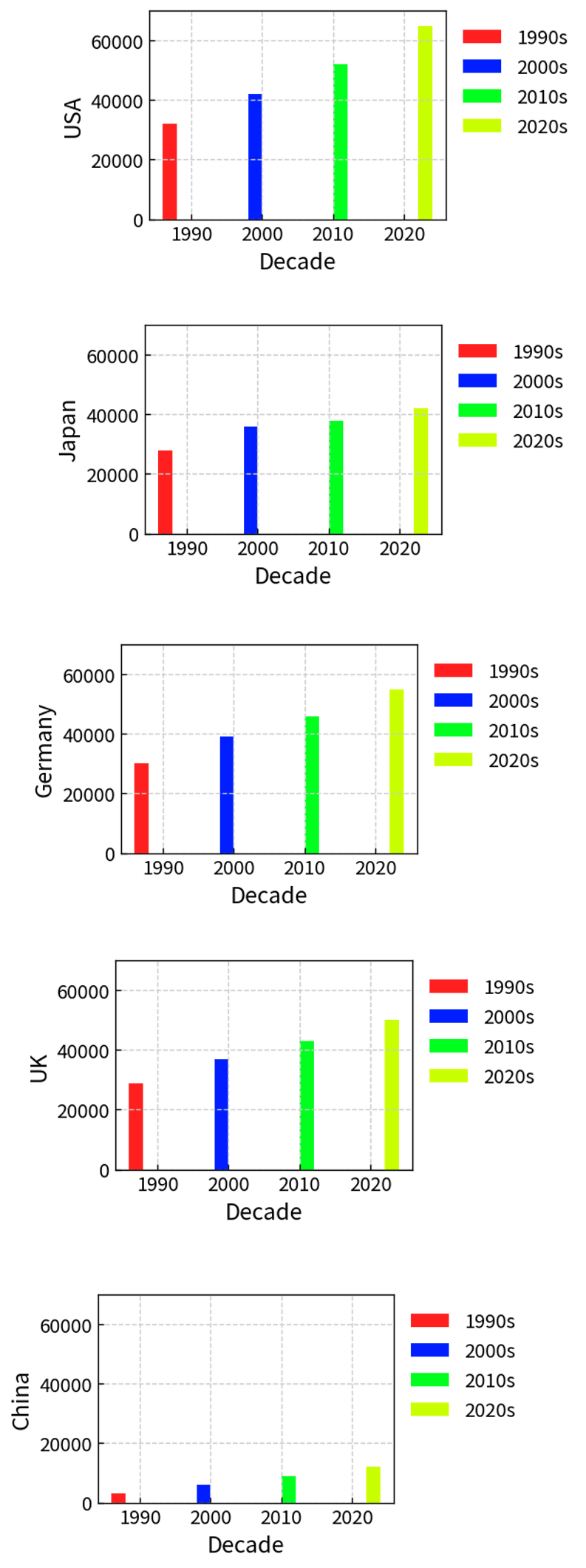
How to Read the Results
United States
The sample rises steadily from the 1990s to the 2020s. A line chart makes the relatively steep slope—and therefore the large absolute increase—easy to see.
Japan
The values increase, but more gradually. Because the comparison is in U.S. dollars, exchange-rate movements can also make the apparent gap larger or smaller than a comparison in local currency.
China
China starts from a much lower level in this sample but records a large proportional increase. A bar chart emphasizes the remaining level gap, while a line chart emphasizes the rise.
Why the Gap Looks Different in the 1990s and 2020s
When countries grow at different rates, their accumulated differences become more visible over time. The choice of decade therefore changes the visual impression even when the underlying series are unchanged.
Income level and income growth are not the same thing. Bar charts are good for levels, line charts for change, and box plots for distributions.
Important Note About the Data
All values in this article are simplified sample data created to demonstrate visualization methods. For a real analysis, replace them with consistent data from an official statistical agency or a trusted international database.