1. What Is a Line Chart?
A line chart uses points connected by lines to show changes over time or changes across an ordered sequence. It makes it easy to see whether values are rising or falling and when important changes occur.
Common uses include:
- Daily or monthly sales trends
- Changes in production volume or yield over time
- Time-series measurements such as temperature, pressure, or current
- Changes in test scores or performance indicators
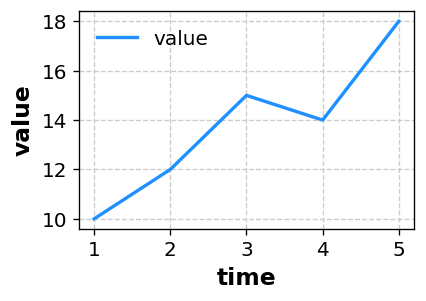
Paste your data in CSV format to create a similar line chart automatically.
2. What Can You Learn from a Line Chart?
2-1. Trends Over Time
The greatest strength of a line chart is that it makes trends over time easy to recognize.
- An upward trend indicates an overall increase.
- A downward trend indicates an overall decrease.
- A repeating wave may indicate seasonality or another cycle.
A visual trend can quickly reveal periods of strong performance or points where a major change occurred.
2-2. Timing and Speed of Change
A steep section of the line indicates that a large change happened in a short period. Comparing that timing with an improvement measure or a problem can provide clues about what caused the change.
2-3. Comparing Multiple Series
Plotting multiple lines makes it possible to compare how different groups or conditions change.
- Which of Line A or Line B remains higher
- Where one series catches up with or overtakes another
- Which series fluctuates more
Differences that are difficult to see in a table are often obvious in a line chart.
3. Preparing Your Data and Axes
A line chart normally places time or an ordered sequence on the X-axis and the measured value on the Y-axis. Sakura Chart accepts data in the following format.
3-1. Single Series
time,value
1,10
2,12
3,15
4,14
5,18
Select time for the X-axis and value for the Y-axis to draw one line.
The time column may contain a sequence such as 1, 2, 3 or dates such as 2025-01-01.
3-2. Multiple Series Using a LEVEL Column
Add a LEVEL column when you want a separate line for each condition or group.
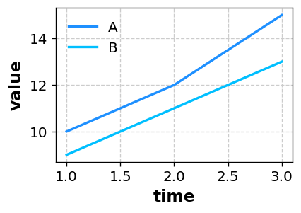
time,value,LEVEL
1,10,A
2,12,A
3,15,A
1,9,B
2,11,B
3,13,B
With this structure, the A and B series appear as two lines on the same chart.
4. How to Create a Line Chart with Sakura Chart
- Prepare
time,value, and, if needed,LEVELcolumns in Excel or a spreadsheet. Copy the data range. - Paste it into the text area on the Sakura Chart home page.
- Select “Continue to preview,” then choose Line as the chart type.
- Select the X-axis column, such as
time, and the Y-axis column, such asvalue. - If your data includes a LEVEL column, select it to separate the data into series.
- Adjust the line color, width, markers, and axis range as needed, then select “Create chart.”
See the How to use page for details about each setting and other chart types.
5. When Should You Use a Line Chart?
- When showing changes in daily or monthly sales or website traffic
- When tracking production volume or yield by production line
- When summarizing time-series data such as temperature, pressure, or current
- When clearly showing the difference before and after an initiative
- When a paper or report needs a figure showing change over time
Line charts are especially good at showing when a change occurred and how large it was. If your data needs to be read along a time axis, a line chart is often the best first choice.
6. Summary
- A line chart shows how values change over time or across an ordered sequence.
- It makes trends, the timing of changes, and differences between multiple series easy to compare.
- Use time or sequence on the X-axis, values on the Y-axis, and a LEVEL column to separate series.
- With Sakura Chart, you can create a line chart simply by pasting data and selecting columns.
Use a line chart when you want to explain how something changes over time. With Sakura Chart, you can quickly create statistical charts without writing code.