1. What Is a Bar Chart?
A bar chart represents values for different categories using the length or height of bars. It is one of the most common chart types for comparing values across items.
Bar charts work well for data such as:
- Sales by product
- Headcount or overtime hours by department
- Production volume or yield by production line
- Survey response counts, such as “Yes” and “No”
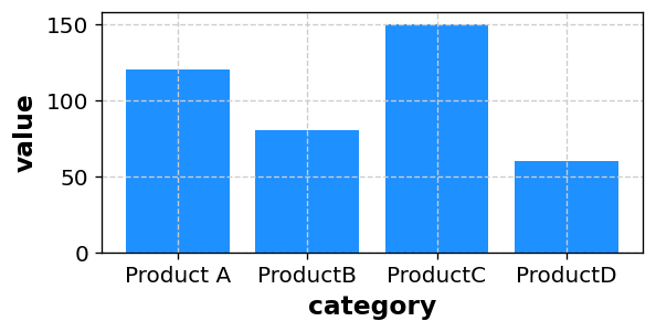
Paste your data in CSV format to create a similar bar chart automatically.
2. What Can You Learn from a Bar Chart?
2-1. Differences Between Categories
The main advantage of a bar chart is that it makes differences between categories easy to see.
- Which category has the highest or lowest value
- How large the difference is between two categories
- Where the higher- and lower-value groups divide
Differences that are hard to grasp in a table often become clear immediately in a bar chart.
2-2. Comparing Values Over Time
When time is placed on the X-axis, a bar chart can compare the size of values across periods. It is useful when exact period-to-period comparison matters more than following a detailed trend.
- Comparing monthly sales
- Comparing annual production volumes
2-3. Comparing Multiple Groups
A bar chart can also compare two dimensions, such as product and region.
In Sakura Chart, use a LEVEL column to create a grouped bar chart.
3. Preparing Your Data
A basic bar chart needs a category for the X-axis and a value for the Y-axis. Sakura Chart can create a bar chart from data in the following format.
3-1. Simple Bar Chart
category,value
Product A,120
Product B,80
Product C,150
Product D,60
Select category for the X-axis and value for the Y-axis.
The resulting chart makes the differences among Products A–D easy to compare.
3-2. Grouped Bar Chart Using a LEVEL Column
Add a LEVEL column when you want to compare groups such as regions or years.
category,value,LEVEL
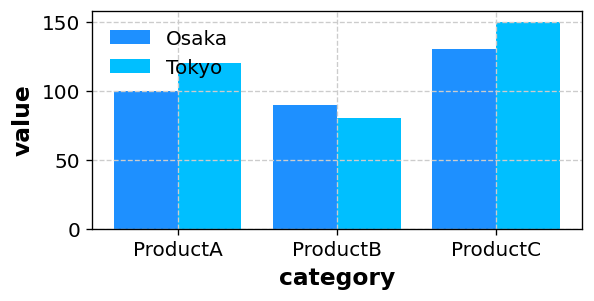
Product A,120,Tokyo
Product B,80,Tokyo
Product C,150,Tokyo
Product A,100,Osaka
Product B,90,Osaka
Product C,130,Osaka
With this structure, Sakura Chart displays the Tokyo and Osaka bars side by side, making regional differences easy to compare.
4. How to Create a Bar Chart with Sakura Chart
- Prepare a table in Excel or a spreadsheet with
category,value, and, if needed,LEVELcolumns. Copy the data range. - Paste it into the text area on the Sakura Chart home page.
- Select “Continue to preview,” then choose Bar as the chart type.
- Select the X-axis column, such as
category, and the Y-axis column, such asvalue. - If your data includes a LEVEL column, select it to separate the bars by group.
- Adjust the bar color, width, labels, and axis range as needed, then select “Create chart.”
Sakura Chart supports vertical, horizontal, and stacked bar charts. See the How to use page for more details.
5. When Should You Use a Bar Chart?
- When comparing values by product, department, production line, or another category
- When comparing multiple groups, such as different years or regions
- When you need to show exact differences more clearly than a pie chart can
- When presenting numerical differences simply in a report or presentation
A pie chart is useful for showing the overall composition, while a bar chart is better at showing which value is larger and by how much.
6. Summary
- A bar chart represents category values using the length of bars.
- It clearly communicates differences and rankings among categories.
- With
category,value, and optionalLEVELcolumns, you can create one easily in Sakura Chart. - Use a pie chart for a broad view of composition and a bar chart for clear comparisons.
When you want to show how much the values differ, a bar chart is usually a good place to start. With Sakura Chart, you can paste your data and create a presentation-ready chart in just a few clicks.