1. Choose a Chart Based on Your Purpose
Choosing a bar chart or line chart out of habit can obscure the point you want to communicate. Each chart type has a particular strength. This guide explains what eight chart types reveal and when to use each one.
2. Contents
3. Scatter Plot
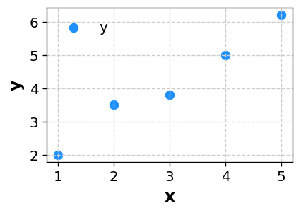
A scatter plot helps you examine the relationship between two numeric variables, as well as clusters, variation, and outliers.
3-1. Good Uses
- Examining the relationship between manufacturing conditions and a quality measure
- Comparing advertising spend with sales, or study time with test scores
- Checking whether two variables tend to increase together or move in opposite directions
Manufacturing data can appear correlated when all lots are combined, then show the opposite pattern after points are colored by machine or material lot. Before relying on a correlation coefficient, use a scatter plot to check group differences and outliers.
3-2. Compare Groups with a LEVEL Column
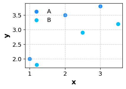
Add a LEVEL column to color points by group and see whether the relationship differs across conditions.
4. Line Chart
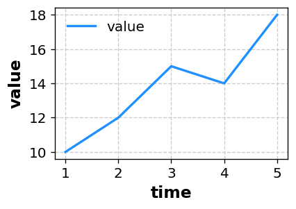
A line chart is best for showing change over time. It makes direction, seasonality, and sudden changes easy to see.
4-1. Good Uses
- Monthly, weekly, or daily trends in sales, traffic, temperature, or other measurements
- Tracking results before and after an improvement
- Finding the time at which an unusual change occurred
Daily averages can hide a brief temperature spike after equipment downtime or a traffic surge immediately after a campaign. Keep time intervals consistent and compare turning points with the events that occurred at the same time.
5. Bar Chart
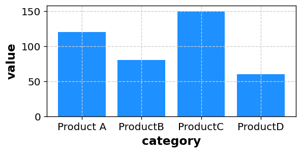
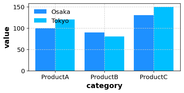
A bar chart is ideal for comparing values across categories. It clearly shows which item is larger and by how much.
5-1. Good Uses
- Comparing products, departments, regions, or production lines
- Showing differences more precisely than a pie chart
- Communicating a conclusion quickly in a report or presentation
Sorting machine downtime or product sales from largest to smallest makes priorities immediately clearer. Start the value axis at zero in most reports; truncating it can exaggerate small differences and mislead readers.
5-2. Grouped Comparisons
A LEVEL column lets you compare categories across groups such as years, regions, or conditions.
6. Box Plot
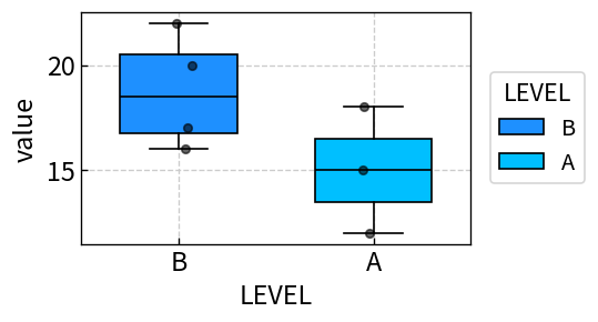
A box plot summarizes a distribution, including its spread, skewness, and possible outliers. It reveals differences that an average alone can hide.
6-1. Good Uses
- Comparing variation in measurements across groups
- Checking whether unusual values are present
- Showing differences in medians and interquartile ranges
When the average remains within specification but defects still occur, a box plot can reveal what the average hides. Place machines, shifts, or production lines side by side to spot isolated outliers and differences in variation.

7. Pie Chart
A pie chart shows each category's share of a whole. It is useful for communicating a broad composition at a glance.
7-1. Good Uses
- Showing the composition of sales or costs
- Presenting shares of survey responses
- Showing how time or resources are allocated
Once a pie chart has more than five or six slices, readers spend more time matching colors to labels than understanding the result. Combine small categories into “Other,” or switch to a bar chart when rankings and small differences matter.

7-2. Keep the Number of Categories Small
Pie charts become hard to read when they contain many slices. Aim for about five or six categories, combine small values into “Other,” and use a bar chart when exact differences matter.
8. Histogram
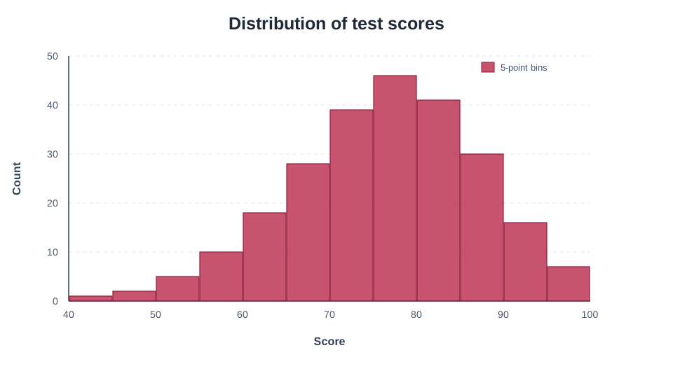
A histogram groups numeric observations into intervals called bins and shows the number of observations in each interval. Use it to inspect where values concentrate, whether a distribution is skewed, and whether it has multiple peaks.
8-1. Good Uses
- Find the most common range of test scores.
- Check the spread of product dimensions or processing times.
9. Combo Chart
A combo chart combines chart types on a shared X-axis. For example, show monthly sales as bars and profit margin as a line to follow both series in one figure.
10. Contour Plot
A contour plot uses colors and contour lines to show Z values across X–Y coordinates. Use it for temperature or concentration at measurement locations, or measured responses across pairs of experimental conditions.
11. Quick Chart-Selection Guide
| What you want to show | Recommended chart | Why it works |
|---|---|---|
| Relationship or correlation | Scatter plot | Shows the direction, strength, clusters, and outliers |
| Change over time | Line chart | Makes trends and turning points easy to follow |
| Differences across categories | Bar chart | Makes rankings and value differences clear |
| Spread, distribution, or outliers | Box plot | Reveals patterns that averages can conceal |
| Share or composition | Pie chart | Communicates the overall balance quickly |
| Shape and peaks of a numeric distribution | Histogram | Compares frequencies across bins |
| Trends in different metrics | Combo chart | Combines bars and lines, optionally with a secondary axis |
| Values across a plane | Contour plot | Shows XYZ data with colors and contour lines |
12. How to Create a Chart with Sakura Chart
Follow these steps for the six standard chart types. Combo and contour charts have separate builders linked above.
- Prepare a table in Excel or a spreadsheet and copy the data range.
- Paste it into the text area on the Sakura Chart home page.
- Select “Continue to chart builder.”
- Choose Scatter, Line, Bar, Box, Pie, or Histogram.
- Select the columns required for your chart; for a histogram, choose the numeric values whose distribution you want to inspect.
- If needed, select a
LEVELcolumn to group or color the data. - Select “Create chart,” then save the generated image.
13. Summary
- Choose a chart according to the purpose of the visualization.
- Use scatter plots for relationships, line charts for trends, bar charts for comparisons, box plots for group spreads, pie charts for proportions, histograms for distribution shapes, combo charts for different metrics, and contour plots for values across a plane.
- Sakura Chart lets you create six standard chart types from pasted data, with separate builders for combo and contour charts.
Try it with your own data. Sakura Chart turns a table into a clear chart without complicated setup.