Five Ways to Create Many Charts in Excel
Store-by-store sales, readings from multiple instruments, and regional time series often require the same chart to be repeated many times. Copying works for a few charts, but changing the source range and title manually becomes slow and error-prone at 20 or 50 charts.
This guide compares five Excel workflows and a no-code option, with ready-to-use VBA and Office Scripts examples.
Quick answer: choose by volume and frequency
| Method | Typical volume | Difficulty | Best use |
|---|---|---|---|
| Copy a chart | 5–10 | Low | A small one-off set |
| Chart template | 5–20 | Low | Consistent styling across workbooks |
| VBA | 10–100+ | Medium | Repeated work in desktop Excel |
| Office Scripts | 10–100+ | Medium | Microsoft 365 and Excel for the web |
| Selectable chart | 1 | Low–medium | Interactive comparison without exports |
| No-code chart tool | Dozens to hundreds | Low | Batch image creation with shared settings |
In this guide
1. Problems with creating many charts manually
Imagine creating a monthly sales column chart for 20 stores. After copying the first chart, you still need to change the data range, title, axis scale, and sometimes the colors 20 times.
- A source range can be shifted by one column without being obvious.
- Colors, dimensions, and axis ranges can drift between charts.
- New rows may require every chart to be updated.
- Many embedded chart objects can make the workbook slow.
- Similar-looking charts make mistakes difficult to spot.
The examples below use column A for the category axis and columns B onward for Tokyo, Osaka, and Fukuoka.
| Month | Tokyo | Osaka | Fukuoka |
|---|---|---|---|
| Jan | 120 | 100 | 80 |
| Feb | 135 | 115 | 95 |
| Mar | 150 | 125 | 110 |
| Apr | 145 | 130 | 120 |
2. Copy the chart when you only need 5–10
- Select the Month and Tokyo columns and insert a clustered column chart.
- Finish the title, color, size, labels, and axis settings.
- Copy the finished chart.
- Right-click the copy and open Select Data.
- Change the series name and values from Tokyo to Osaka, then repeat for Fukuoka.
This is the fastest choice for a small one-off task. If the work repeats every month, automation usually pays off.
3. Standardize the design with a chart template
- Finish the chart type, colors, fonts, legend, and axes.
- Right-click the chart and choose Save as Template.
- Save the
.crtxfile. - Apply it later from the Templates category in the chart dialog.
4. Create dozens of charts with VBA
The following macro reads categories from column A and creates one line chart with markers for each column from B onward.
It places the charts in a worksheet named Charts in a two-column layout.
- Rename the worksheet containing the source table to
Data. The name must matchWorksheets("Data")in the macro. - Save the workbook as an Excel Macro-Enabled Workbook (
.xlsm). - Press
Alt+F11. - Choose Insert, then Module.
- Paste the code and run the macro.
Option Explicit

Sub CreateLineChartsByColumn()

    Dim wsData As Worksheet
    Dim wsChart As Worksheet
    Dim chartObj As ChartObject
    Dim lastRow As Long
    Dim lastCol As Long
    Dim col As Long
    Dim leftPos As Double
    Dim topPos As Double

    On Error GoTo ErrorHandler

    Set wsData = ThisWorkbook.Worksheets("Data")

    ' Get the output worksheet, or create it when it does not exist
    On Error Resume Next
    Set wsChart = ThisWorkbook.Worksheets("Charts")
    On Error GoTo ErrorHandler

    If wsChart Is Nothing Then
        Set wsChart = ThisWorkbook.Worksheets.Add(After:=wsData)
        wsChart.Name = "Charts"
    End If

    lastRow = wsData.Cells(wsData.Rows.Count, 1).End(xlUp).Row
    lastCol = wsData.Cells(1, wsData.Columns.Count).End(xlToLeft).Column

    If lastRow < 2 Or lastCol < 2 Then
        MsgBox "No usable chart data was found.", vbExclamation
        Exit Sub
    End If

    Application.ScreenUpdating = False

    ' Delete charts from the previous run
    Do While wsChart.ChartObjects.Count > 0
        wsChart.ChartObjects(1).Delete
    Loop

    ' Create one chart for each column from B onward
    For col = 2 To lastCol

        ' Arrange charts in two columns
        leftPos = 20 + ((col - 2) Mod 2) * 500
        topPos = 20 + Int((col - 2) / 2) * 290

        Set chartObj = wsChart.ChartObjects.Add( _
            Left:=leftPos, _
            Top:=topPos, _
            Width:=460, _
            Height:=250)

        With chartObj.Chart
            .ChartType = xlLineMarkers
            .SeriesCollection.NewSeries

            With .SeriesCollection(1)
                .Name = CStr(wsData.Cells(1, col).Value)
                .XValues = wsData.Range( _
                    wsData.Cells(2, 1), _
                    wsData.Cells(lastRow, 1))
                .Values = wsData.Range( _
                    wsData.Cells(2, col), _
                    wsData.Cells(lastRow, col))
            End With

            .HasTitle = True
            .ChartTitle.Text = CStr(wsData.Cells(1, col).Value)
            .HasLegend = False
        End With

    Next col

    Application.ScreenUpdating = True
    MsgBox CStr(lastCol - 1) & " chart(s) created.", vbInformation
    Exit Sub

ErrorHandler:
    Application.ScreenUpdating = True
    MsgBox "Charts could not be created." & vbCrLf & _
           "Check the worksheet names and data layout." & vbCrLf & _
           "Error: " & Err.Description, vbExclamation

End Sub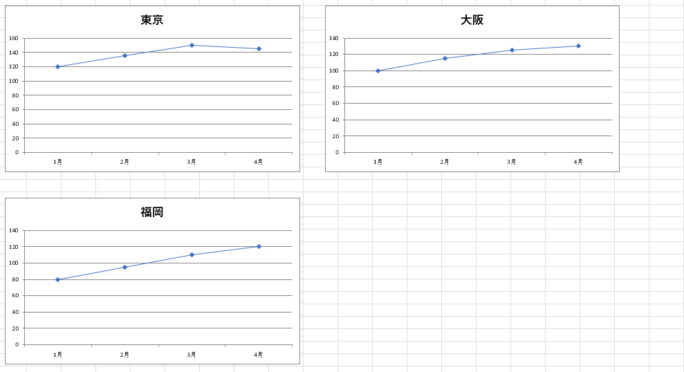
This example uses xlLineMarkers. Change it to xlColumnClustered, xlBarClustered,
xlXYScatter, or xlPie for another chart type.
Charts output sheet before rebuilding them.
Test it in a copy of your workbook or change the output sheet name if those charts must be preserved.
5. Use Office Scripts in Microsoft 365
Office Scripts can record and automate Excel work in supported Microsoft 365 environments. Open the Automate tab, create a new script, paste the code below, and run it.
function main(workbook: ExcelScript.Workbook) {
  const dataSheet: ExcelScript.Worksheet | undefined =
    workbook.getWorksheet("Data");

  if (!dataSheet) {
    throw new Error("The Data worksheet was not found.");
  }

  const firstCell: ExcelScript.Range = dataSheet.getRange("A1");

  if (firstCell.getText().trim() === "") {
    throw new Error("No data table beginning in A1 was found.");
  }

  const dataRange: ExcelScript.Range =
    firstCell.getSurroundingRegion();

  const rowCount: number = dataRange.getRowCount();
  const columnCount: number = dataRange.getColumnCount();

  if (rowCount < 2 || columnCount < 2) {
    throw new Error("There is not enough data to create charts.");
  }

  let outputSheet: ExcelScript.Worksheet | undefined =
    workbook.getWorksheet("Charts");

  if (!outputSheet) {
    outputSheet = workbook.addWorksheet("Charts");
  }

  outputSheet.getCharts().forEach(
    (chart: ExcelScript.Chart) => chart.delete()
  );

  const seedRange: ExcelScript.Range =
    outputSheet.getRange("A1:A2");

  seedRange.setValues([
    ["Temporary"],
    [0]
  ]);

  const xRange: ExcelScript.Range =
    dataSheet.getRangeByIndexes(
      1,
      0,
      rowCount - 1,
      1
    );

  let chartIndex: number = 0;

  for (let col: number = 1; col < columnCount; col++) {
    const title: string =
      dataRange.getCell(0, col).getText().trim();

    if (title === "") {
      continue;
    }

    const yRange: ExcelScript.Range =
      dataSheet.getRangeByIndexes(
        1,
        col,
        rowCount - 1,
        1
      );

    const chart: ExcelScript.Chart =
      outputSheet.addChart(
        ExcelScript.ChartType.line,
        seedRange
      );

    chart.getSeries().forEach(
      (existingSeries: ExcelScript.ChartSeries) =>
        existingSeries.delete()
    );

    const series: ExcelScript.ChartSeries =
      chart.addChartSeries(title);

    series.setXAxisValues(xRange);
    series.setValues(yRange);

    chart
      .getAxes()
      .getCategoryAxis()
      .setCategoryType(
        ExcelScript.ChartAxisCategoryType.textAxis
      );

    chart.getTitle().setText(title);
    chart.getLegend().setVisible(false);

    chart.setWidth(460);
    chart.setHeight(250);
    chart.setLeft(20 + (chartIndex % 2) * 500);
    chart.setTop(
      20 + Math.floor(chartIndex / 2) * 290
    );

    chartIndex++;
  }

  seedRange.clear(
    ExcelScript.ClearApplyTo.contents
  );
}
This approach suits Excel for the web, shared team workflows, and Power Automate integration. Availability depends on the Microsoft 365 license and the organization's administrator settings.
6. Build one selectable chart if comparison is the goal
If users only need to inspect one location at a time, a drop-down-driven chart can replace dozens of embedded charts. Put a location selector in H2, enter the formula below in I2, fill it down, and chart columns A and I.
MATCH finds the selected column and INDEX returns its values. Link the chart title to H2 with:
This keeps the workbook lighter and works well for dashboards, but it does not create separate images for every location.
7. Create many charts without writing code
A no-code workflow is useful when macros are blocked or the batch is occasional. Look for a tool that can:
- accept a pasted Excel or spreadsheet table;
- read CSV files;
- split the data into groups;
- apply shared colors and dimensions; and
- save the results as images.
8. Create the batch in Sakura Chart
Sakura Chart accepts pasted spreadsheet data or CSV. Add a LEVEL column containing the store, machine, sample,
or other value that should separate the groups.
Step 1: Reshape the table into long format
| LEVEL | month | sales |
|---|---|---|
| Tokyo | Jan | 120 |
| Tokyo | Feb | 135 |
| Tokyo | Mar | 150 |
| Osaka | Jan | 100 |
| Osaka | Feb | 115 |
| Osaka | Mar | 125 |
| Fukuoka | Jan | 80 |
| Fukuoka | Feb | 95 |
| Fukuoka | Mar | 110 |
Step 2: Paste the table
Include the header row, remove blank rows, keep units out of numeric cells, and standardize group names.
Step 3: Choose the columns
- X:
month(text categories such as Jan, Feb, and Mar) - Y:
sales - LEVEL:
LEVEL - Display mode: Split (one chart per LEVEL)
- Chart type: clustered column
Step 4: Set shared visual rules
Choose the title, colors, image size, legend, and axis limits. Use the same vertical range when the purpose is direct comparison; automatic ranges can make a small change look larger than it is.
Step 5: Check the output
Confirm the group split, X order, numeric parsing, titles, and axis ranges before saving the images.
Try the sample data
Open the chart builder with the Tokyo, Osaka, and Fukuoka sample already entered.
9. Common errors and cautions
Rows and columns are reversed
Use Switch Row/Column in Chart Design, or set XValues and Values explicitly in VBA.
Dates appear out of order
Check whether Excel stores them as text. Changing the display format alone may not convert text into real date values.
Numbers do not appear
Remove text such as currency units, words like “about,” and placeholders from numeric cells. Put units in formatting or axis labels.
Charts overlap
Calculate left and top positions from the loop index. The examples above arrange two charts per row.
The VBA macro will not run
Use an .xlsm file, enable only trusted content, check organization policies, and test in a workbook copy.
The Automate tab is missing
Office Scripts availability depends on the license and administrator settings.
The workbook is becoming slow
Use one selectable chart for viewing, or create image files rather than keeping hundreds of chart objects inside the workbook.
Summary
- Copy the chart for a small one-off set.
- Use a chart template to standardize appearance.
- Use VBA for repeated work in desktop Excel.
- Use Office Scripts in a supported Microsoft 365 workflow.
- Use one selectable chart when separate files are unnecessary.
- Use a no-code chart tool when you need a large set of consistent images.
Automation is not only about saving time. It also keeps source ranges, axes, and styling consistent and reduces errors. Choose VBA or Office Scripts when the data must remain in Excel, and Sakura Chart when no-code batch output fits the task.