What a Weight-and-Calorie Chart Reveals by Sex
What You Can Explore
Visualizing body weight from 30 to 100 kg against several calorie-expenditure estimates makes it easy to see which values rise with weight and where the illustrative male and female series differ.
- X axis:
Body weight [kg] - Y axis: 24-hour basal metabolism, one hour of walking or running, or basal metabolism plus eight hours of desk or standing work
- LEVEL: sex (male or female)
This CSV is a simplified model created for chart practice. It is not a personal calorie calculator or a medical estimate. Age, height, body composition, pace, and other factors would be required for a realistic calculation.
Copy the Wide-Format Sample CSV
The dataset contains one weight column, five metric columns, and a sex column. The column labels and category values remain in Japanese so that both language versions use exactly the same source data.
Recommended Sakura Chart Settings
- Chart type: Line chart or bar chart
- X axis:
体重[kg] - Y axis: begin with
基礎代謝24時間[kcal], then compare the other metrics - LEVEL:
男女
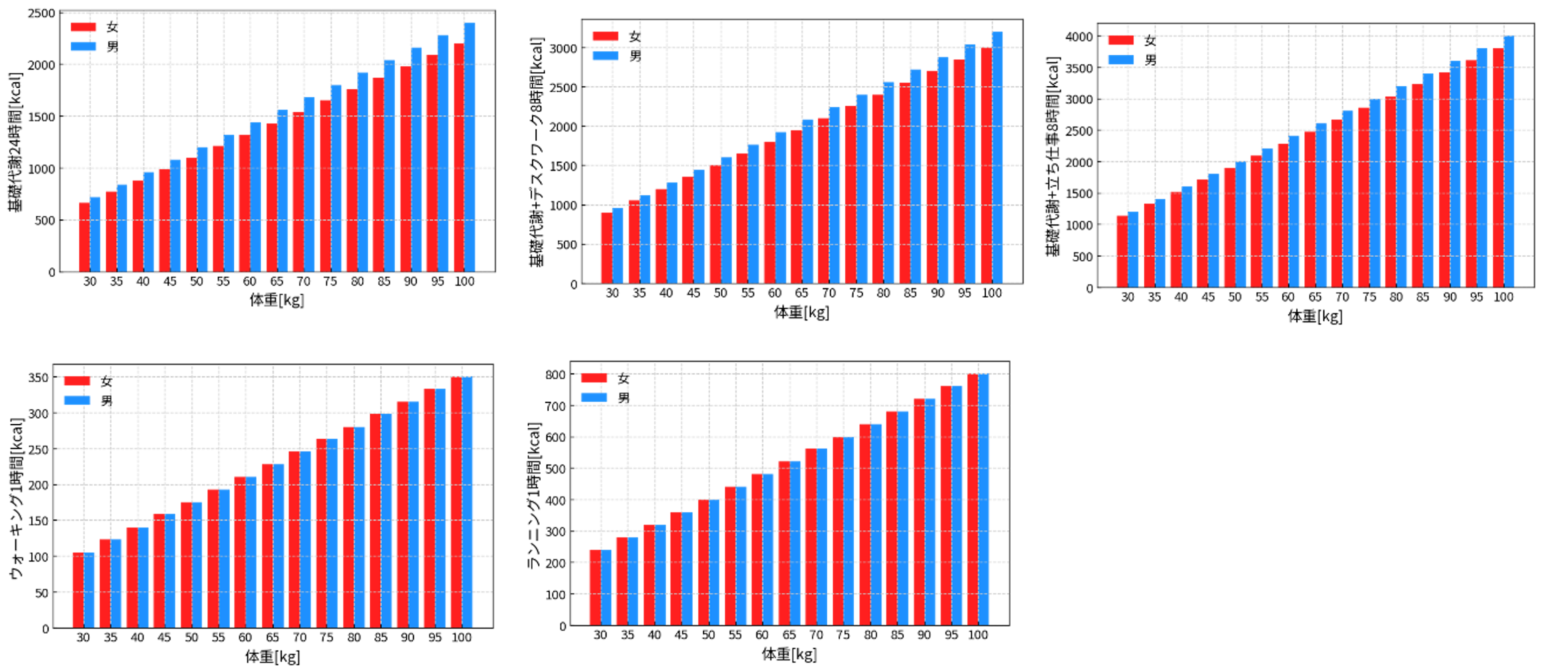
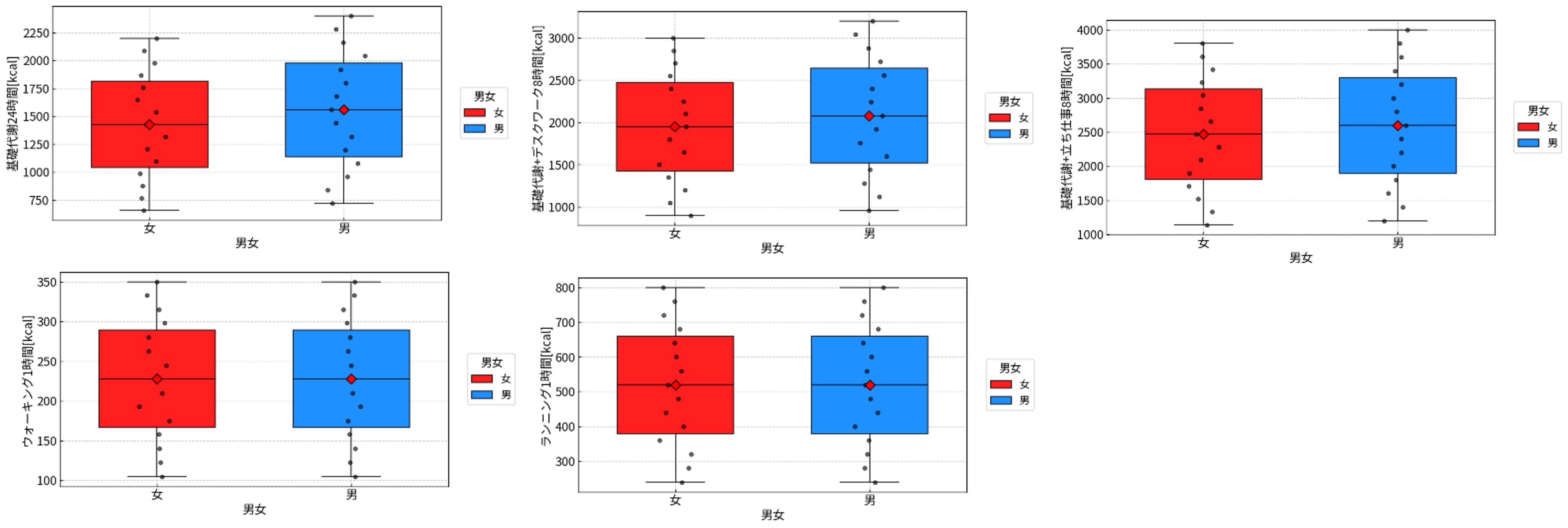
A useful sequence is to start with a line chart for the trend, switch to bars to emphasize differences at each weight, and then use a box plot to summarize the distributions.
Example Charts
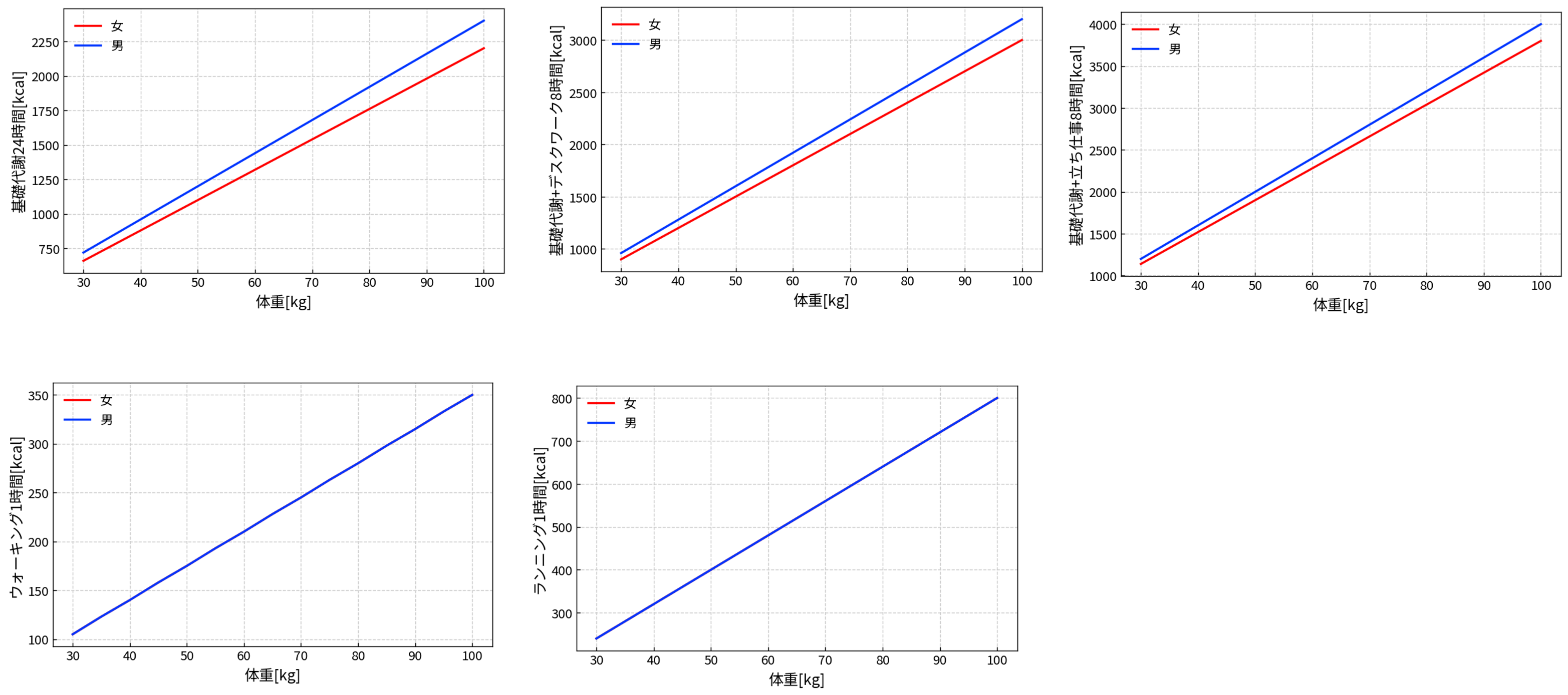
Line Charts: Weight vs. Calorie Expenditure
Bar Charts: Side-by-Side Comparisons at Each Weight
Box Plots: Comparing the Overall Distributions
Observation 1: Exercise Values Show Little Difference Between the Sexes
In this model, the male and female lines for one hour of walking or running nearly overlap. That is intentional: the calculation assumes that weight, intensity, and duration dominate exercise expenditure when those inputs are the same.
- Exercise expenditure is modeled mainly from body weight × intensity × time.
- Sex-related differences are not modeled as strongly as they are for basal metabolism.
The overlap is therefore a property of the assumptions, not proof that real individuals expend identical amounts.
Observation 2: Basal Metabolism Shows a Larger Gap
The 24-hour basal-metabolism series are separated because the model uses different coefficients. In real estimation formulas, age, height, lean mass, and body composition can all affect resting energy expenditure.
- The male series uses a somewhat higher coefficient in this sample.
- The female series uses a somewhat lower coefficient in this sample.
Treat the gap as a visualization example, not as an individual prediction.
Observation 3: Eight Hours of Daily Activity Can Outweigh One Hour of Exercise
The desk-work and standing-work totals can add more energy than a single hour of exercise because the activity continues for much longer. The chart highlights how intensity and duration work together.
- Low-intensity activity can accumulate over many hours.
- Standing work creates a clearer increase when its intensity-times-duration value is larger.
How to Make the Model More Realistic
The current model favors clarity. To create a richer practice dataset, you could add:
- an age column to model changes in basal metabolism,
- a height column for a standard BMR formula,
- an exercise-intensity or speed column, or
- small individual variation so equal weights do not always produce identical values.