1. What Is a Histogram?
A histogram divides numeric data into equal intervals and uses bar height to show how many values, or what proportion of values, fall into each interval. It helps you see where the data is concentrated and how widely it varies.
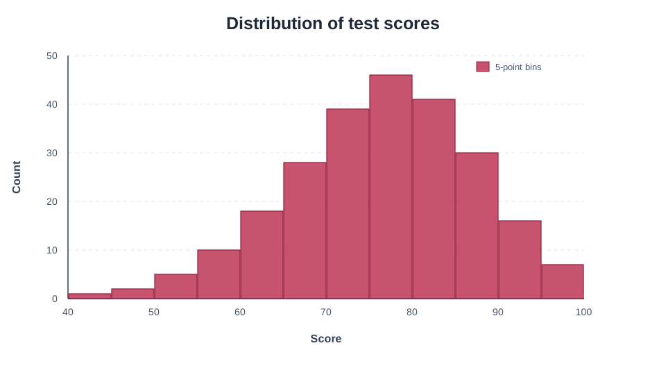
For example, test scores can be grouped into intervals such as 40 to below 45 and 45 to below 50. Each interval is called a bin, and the number of observations in a bin is its frequency.
2. What Can a Histogram Reveal?
2-1. The Center of the Data
The tallest region shows where many values are concentrated. This can reveal a common price range or measurement range that is not obvious from the mean or median alone.
2-2. Spread
A distribution spread widely across the X-axis has greater variation than one concentrated in a narrow interval. In manufacturing data, this can provide an initial view of process stability.
2-3. Shape
- Symmetric: the two sides spread in a similar way around the center
- Long right tail: a small number of unusually high values
- Long left tail: a small number of unusually low values
- Two or more peaks: possible mixing of different groups or conditions
- Isolated bars or gaps: a reason to check outliers, measurement limits, or input errors
The apparent number of peaks can change with the bins. Do not identify a distribution or its cause from one histogram alone; review the raw data, a box plot, and summary statistics as well.
3. Histogram vs. Bar Chart
Histograms and bar charts look similar but represent different information.
| Feature | Histogram | Bar chart |
|---|---|---|
| Main purpose | Show a numeric distribution | Compare values across categories |
| X-axis | Continuous numeric intervals | Categories such as products or departments |
| Order | Fixed numeric order | Can be reordered for the purpose |
| Spacing | Bars normally touch because intervals are continuous | Bars are normally separated because categories are distinct |
| Bar height | Frequency or density in an interval | The value assigned to a category |
Use a histogram for an age distribution and a bar chart for sales by age group.
4. Preparing Your Data
Put the numeric values you want to analyze in one column. Add a group column, such as sex, machine, or product, when you want to compare distributions.
Measurement,Machine
10.2,A
10.5,A
10.4,A
10.8,A
11.0,A
9.8,B
10.1,B
10.3,B
10.6,B
10.9,B
Select Measurement as X to plot the overall distribution.
Select Machine as the legend column to compare Machines A and B by color.
Blank values and values that cannot be interpreted as numbers are excluded from the histogram calculation.
5. How Many Bins Should You Use?
The number of bins strongly affects the appearance of a histogram.
- Too few: the distribution is oversimplified, potentially hiding peaks or skewness.
- Too many: random variation produces a noisy shape that can be mistaken for a meaningful pattern.
Sakura Chart starts with 20 bins. Review that result, then try values such as 10, 15, or 30 to see whether the main features remain stable. Fewer observations generally need fewer bins, while a larger dataset can support more detail.
There is no single correct bin count. Choose bins that reveal stable structure rather than bins selected to support a preferred conclusion.
6. How to Create a Histogram with Sakura Chart
- Paste CSV or TSV data into the Sakura Chart input area and continue to the preview.
- Select the Histogram icon as the chart type.
- Choose the numeric column to analyze as X. A histogram does not use the Y selection.
- If you want a group comparison, choose a legend column.
- Under chart-specific settings, adjust bins, mode, histtype, and alpha.
- If needed, enable density, cumulative, or log Y.
- Select Create chart, review the distribution and axes, and save the image.
7. Histogram Settings in Sakura Chart
| Setting | Meaning and use |
|---|---|
bins | The number of intervals. More bins show finer detail; fewer bins show a broader shape. |
overlay | Places legend-group distributions on the same axes. Lower alpha makes overlaps easier to see. |
stacked | Stacks legend-group frequencies within each bin to show both the total and group composition. |
bar | Standard filled bars, useful for an intuitive view of one distribution. |
step | Draws distribution outlines, making several overlaid group shapes easier to compare. |
stepfilled | Fills the area inside a stepped outline to emphasize both shape and area. |
density | Uses density instead of raw count, useful for comparing shapes when group sample sizes differ. |
cumulative | Accumulates frequency from left to right to show how many values are at or below a threshold. |
log Y | Uses a logarithmic Y-axis when frequencies differ greatly and low-frequency bins still matter. |
alpha | Controls transparency. For overlaid groups, values around 0.4 to 0.7 are often a useful starting point. |
With both density and cumulative enabled, the result can be read as a cumulative proportion approaching 1.
Disable density when you need cumulative counts.
8. Common Reading Mistakes
8-1. Comparing Unequal Groups with Raw Counts
If Group A has 1,000 observations and Group B has 100, Group A's bars will be taller even when their shapes are identical. Use density when comparing shapes, or clearly state the sample sizes.
8-2. Trusting Only One Bin Setting
Before concluding that the distribution has two peaks or many outliers, change the bin count and see whether the pattern remains.
8-3. Confusing Bar Height with the Mean
Bar height is the frequency or density inside an interval. It does not directly show the mean.
8-4. Ignoring Raw Values in a Small Dataset
With only a few observations, the bin boundaries have a large effect. Review the raw values together with a box plot or scatter plot.
9. Summary
- A histogram divides numeric values into intervals to show a distribution.
- It can reveal the center, spread, skewness, and multiple peaks.
- Because the shape changes with the bins, check whether the main pattern is stable across several settings.
- Use overlay, step, and density settings according to the purpose of a group comparison.
In Sakura Chart, select a numeric column to create a histogram and adjust bins, density, and cumulative display. Try it with measurements, scores, ages, prices, or another numeric dataset.