1. What Is a Box Plot?
A box plot is a statistical chart that summarizes a dataset's spread, variability, and outliers. It makes patterns that an average alone can hide—such as skewness or an unusually wide distribution—much easier to see.
A box plot typically shows five key values:
- Minimum value
- First quartile (Q1)
- Median (Q2)
- Third quartile (Q3)
- Maximum value

Paste your data in CSV format to create a similar box plot automatically.
2. How to Read a Box Plot
2-1. Median
The line inside the box is the median. Half of the observations fall below it and half fall above it, so it is a useful measure of the center even when the data includes extreme values.
2-2. Quartiles and the Box
The bottom and top of the box represent the first and third quartiles. The box contains the middle 50% of the data, and its height or width is called the interquartile range (IQR). A larger box indicates greater variation.
2-3. Whiskers and Outliers
The lines extending from the box are the whiskers. Points beyond the whiskers may be displayed as outliers. Outliers are not automatically errors; they may indicate an unusual event, a special condition, or a measurement problem worth investigating.
3. Preparing Your Data
A simple box plot needs one numeric column.
value
12
15
11
18
14
16
13
Select value as the Y-axis column to visualize its distribution.
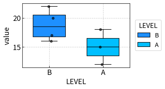
3-2. Comparing Groups with a LEVEL Column
Add a LEVEL column to compare distributions across groups.
value,LEVEL
12,Group A
15,Group A
11,Group A
18,Group B
14,Group B
16,Group B
Sakura Chart creates one box for each LEVEL value, making differences in the median, spread, and outliers easy to compare.
4. How to Create a Box Plot with Sakura Chart
- Prepare a numeric column such as
valuein Excel or a spreadsheet. Add aLEVELcolumn if you want to compare groups, then copy the table. - Paste the table into the text area on the Sakura Chart home page.
- Select “Continue to preview,” then choose Box as the chart type.
- Select the numeric Y-axis column. If available, select the LEVEL column used for grouping.
- Adjust the colors, line width, axis range, and outlier display as needed, then select “Create chart.”
See the How to use page for more details about the controls and other chart types.
5. When Should You Use a Box Plot?
- Comparing score or quality distributions across classes, departments, or production lines
- Checking sensor readings or measurements for possible outliers
- Showing differences in variability that averages do not reveal
- Comparing group distributions in a paper or report
Two groups can have the same average but very different levels of variation. A box plot makes the difference between a stable group and a widely scattered group visible.
6. Summary
- A box plot summarizes a distribution, including its center, spread, skewness, and possible outliers.
- The median and interquartile range help you understand the center and variability of the data.
- A LEVEL column lets you compare several groups in one chart.
- With Sakura Chart, you can paste a table and select a column to create a box plot quickly.
When an average does not tell the whole story, try a box plot. Sakura Chart lets you create a clear statistical chart without complicated setup.