Visualizing Japan's Industrial Production Index by Industry
What This Article Covers
This example uses the Excel workbook published by Japan's Ministry of Economy, Trade and Industry (METI) for the Indices of Industrial Production (IIP). The monthly series are plotted as trend lines in Sakura Chart. Comparing broad indices with detailed steel-related categories reveals movements that disappear when everything is viewed as a single headline number.
- X axis:
年月(year and month) - Y axis: total industry, manufacturing, iron and steel, steel tubes, coated steel, cast and forged products, and other series
- Chart type: trend line
This article focuses on preparing and visualizing the data and on patterns visible in the chart. A precise economic interpretation depends on each series' definition, seasonal-adjustment status, coverage, and base year.
Official Data Sources
The source workbook and its accompanying results page are published by METI:
Details to Check Before Plotting the Workbook
The workbook is comprehensive, but its date codes and special values need a little preparation.
- Read the usage notes: check the notes on the publication page together with the workbook.
- Data through December 2017: METI directs users to the published linked indices. These adjust older-base indices so they can be compared with the 2020-base series for convenience.
-
Date codes: monthly values use six digits such as
202510; quarters useYYYYQ1throughYYYYQ4; calendar years useYYYYCY; and fiscal years useYYYYFY. For Sakura Chart, converting a monthly code to a date such as2025/10/1makes it easier to plot. - Preliminary values: a
Pshown to the left of a date marks a preliminary figure. -
Xand***:Xmay be used to protect confidentiality when only one or two establishments are represented, while***may indicate that an index is not compiled. Treat both as missing values before plotting so the column is not interpreted as text. - External source statistics: some IIP components use data from other ministries, including statistics on dairy products, oilseed processing, shipbuilding, machinery, and railway vehicles.
- Release schedule: use METI's annual publication calendar when you need to follow future updates.
Example Small-Multiple Chart
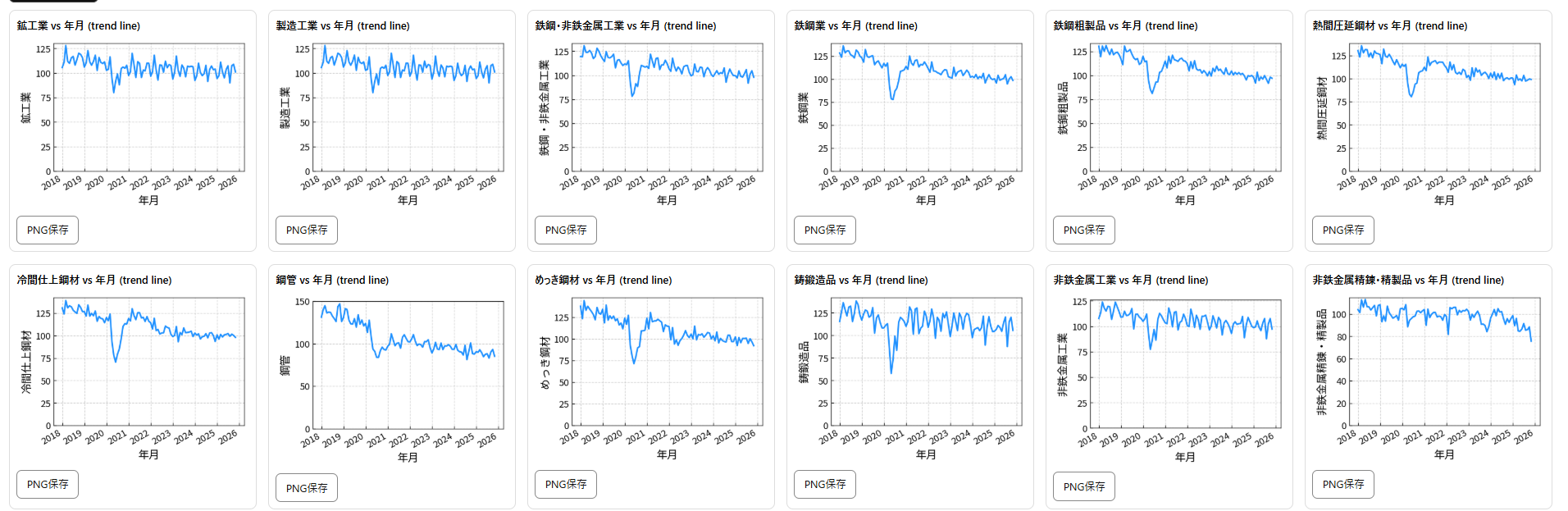
The same monthly dataset is shown one series at a time so that each industry's shape remains readable.
What Stands Out in the Data
1. The Spring 2020 Drop Appears Across Nearly Every Series
The most prominent feature from 2018 to 2025 is the sharp fall around April to June 2020. Manufacturing falls from 116.5 in March to 80 in May, while cast and forged products reach 57.7. When many unrelated series decline at the same time, the chart points to a broad shock rather than a problem confined to one product category.
2. The Recovery Differs by Industry
Most series recover during late 2020 and 2021, but not at the same speed or to the same level. Total industry and manufacturing both exceed 120 in March 2021. Steel-related series then diverge: steel tubes, for example, tend to remain lower during 2024 and 2025. Even within steel, end markets and applications produce different cycles.
3. Broad and Detailed Indices Answer Different Questions
A broad index can look flat while individual components rise and fall. Coated steel, for example, moves roughly through the 90s to 110s in many months after recovering from its 2020 low. Small multiples make these product-level cycles visible without losing the overall context.
How to Reproduce the Chart in Sakura Chart
- Download the Excel workbook from the official link above.
- Locate the monthly table you want to analyze.
- Copy
年月and the industry columns you want to compare. - Paste the table into Sakura Chart.
- Select trend line as the graph type.
- Switch the selected Y column and save each PNG to build a small-multiple set.
Remove or replace X and *** before plotting. A text value inside a numeric column can prevent the data from being read correctly.
Copy the Prepared Real-Data Sample
The Japanese section contains a wide-format extract with one date column and multiple IIP series. The column labels remain in Japanese so both language versions use the exact same source data.
Useful Ways to Continue the Analysis
- Move from broad to detailed series: total industry and manufacturing, then metals, then products such as steel tubes and coated steel.
- Use the May 2020 trough to compare the size of each decline and the pace of recovery.
- For volatile series such as cast and forged products, consider whether the swings may reflect uneven order cycles.
Viewing the same period across several series can provide a more operational picture than a single headline index.