What Monthly Temperatures Across 10 World Cities Reveal
What You Can Explore
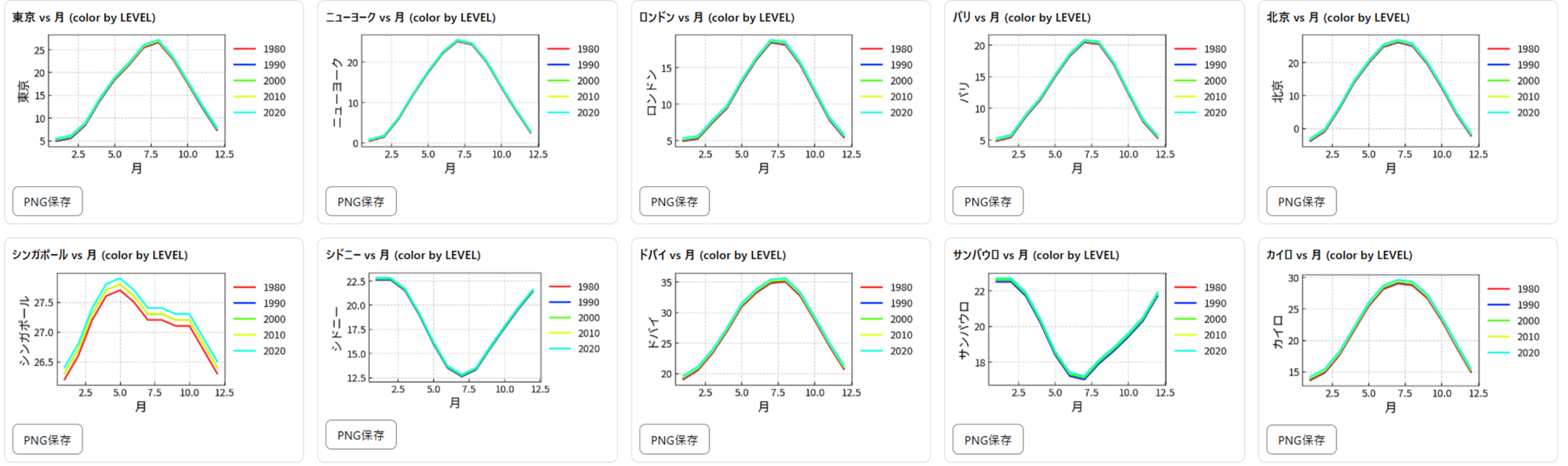
Plotting month (1–12) against temperature (°C) and coloring the lines by year makes seasonal patterns and differences between decades easy to compare.
- X axis:
Month - Y axis: one or more city temperature columns
- LEVEL: year (1980, 1990, 2000, 2010, or 2020)
The CSV on this page is illustrative synthetic data, not an observational climate dataset. Replace it with monthly averages from a meteorological agency or climate database for real-world analysis.
Copy the Wide-Format Sample CSV
The dataset places the month first, followed by 10 city columns and a LEVEL column. It contains five selected years at ten-year intervals.
Recommended Sakura Chart Settings
- Chart type: Line chart
- X axis:
Month - Y axis: start with two to four city columns for readability
- LEVEL:
LEVEL
Example Charts
Line Charts: Month vs. Temperature, Colored by Year
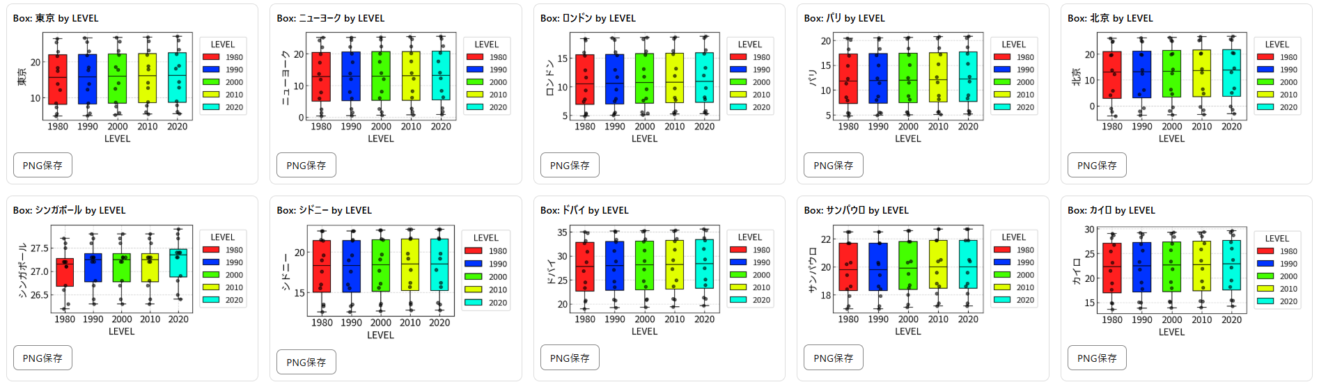
Box Plots: Comparing Each City's Distribution by Year
Observation 1: Why Sydney and São Paulo Look Reversed
Tokyo and New York are warmest around July or August, while Sydney and São Paulo are warmest around January or February. This is not a data error. The seasons are offset by roughly six months because the cities are in opposite hemispheres.
- Northern Hemisphere: summer is generally June through August.
- Southern Hemisphere: summer is generally December through February.
Overlaying monthly lines makes this reversal immediately visible.
Observation 2: Why Singapore's Yearly Gap May Look Larger
In this illustrative dataset, Singapore's lines appear more separated by year than those of several other cities. The first question is whether the gap comes from the constructed data or from a meaningful climate pattern.
Check the Pattern Before Interpreting It
Calculate Singapore's mean or median for each LEVEL. If every month shifts in the same direction, the chart contains a broad yearly offset. If only certain months shift, seasonal effects may be involved.
Possible Factors in Real Observational Data
- Urbanization: changes around a station can affect local temperature measurements.
- Ocean influence: sea-surface temperature and cloud cover can vary between years.
- ENSO: El Niño and La Niña can make particular years warmer or cooler.
These are hypotheses, not conclusions. Identifying the cause requires real measurements and information about the station.
Observation 3: Why Long-Term Warming Is Hard to See Here
Some newer LEVEL lines sit slightly higher, but the chart does not show a dramatic upward trend. That does not demonstrate an absence of warming; this particular visualization is simply not well designed to detect a small long-term signal.
- Seasonal differences can span 10–30°C.
- Decadal changes are much smaller and can be hidden by the seasonal cycle.
- Monthly averages smooth out extremes such as exceptionally hot days.
To make a long-term trend clearer, you could:
- plot one annual mean value per year,
- convert each month to a temperature anomaly, or
- add a regression line to a longer time series.