Matplotlib Basics: Creating Charts with Python
Matplotlib is one of the most widely used Python libraries for data visualization. It can create line charts, bar charts, scatter plots, histograms, box plots, and many other figures directly from code.
This guide takes you from installation to your first chart, then covers styling, saving images, common problems, and the practical differences between Matplotlib, Excel, and the no-code Sakura Chart tool.
Contents
1. What Is Matplotlib?
Matplotlib is a Python visualization library commonly used with NumPy and pandas. It is useful for data analysis, research, production monitoring, and automated report generation.
- Repeat the same chart design with new datasets
- Control colors, lines, axes, legends, annotations, and layouts
- Export figures as PNG, SVG, PDF, and other formats
- Arrange several charts in a single Figure
Its main tradeoff is that you generally create and edit charts through Python code rather than direct on-screen controls.
2. Install Matplotlib
With Python installed, run the following command in a terminal or command prompt:
python -m pip install matplotlibIn an Anaconda environment, you can use:
conda install matplotlibThen import pyplot with its conventional alias:
import matplotlib.pyplot as plt3. Create Your First Line Chart
import matplotlib.pyplot as plt

month = [1, 2, 3, 4, 5]
sales = [120, 150, 135, 180, 210]

fig, ax = plt.subplots()
ax.plot(month, sales, marker="o")
ax.set_xlabel("Month")
ax.set_ylabel("Sales")
ax.set_title("Monthly Sales")

plt.show()
ax.plot() draws the line, the setter methods add labels and a title,
and plt.show() displays the completed figure.
4. Understand Figure and Axes
| Object | Role | Think of it as |
|---|---|---|
Figure | The container for the complete image | The whole canvas |
Axes | The region where data is plotted | One chart with coordinate axes |
fig, ax = plt.subplots(figsize=(7, 4))
For several charts, specify rows and columns, such as plt.subplots(2, 2).
The explicit fig and ax style is especially helpful for reusable code and multi-chart layouts.
5. Common Chart Types and Methods
| Purpose | Chart | Main method |
|---|---|---|
| Change over time | Line chart | ax.plot(x, y) |
| Compare categories | Bar chart | ax.bar(x, height) |
| Relationship between variables | Scatter plot | ax.scatter(x, y) |
| Distribution of values | Histogram | ax.hist(data) |
| Median, spread, and outliers | Box plot | ax.boxplot(data) |
| Share of a whole | Pie chart | ax.pie(values) |
import matplotlib.pyplot as plt
import numpy as np

x = np.arange(1, 6)
y = np.array([12, 19, 15, 24, 28])
group_a = np.array([11, 13, 12, 16, 15, 18])
group_b = np.array([8, 10, 9, 11, 12, 13])

fig, axes = plt.subplots(2, 2, figsize=(10, 6), layout="constrained")

axes[0, 0].plot(x, y, marker="o", color="#be3455")
axes[0, 0].set_title("Line")

axes[0, 1].bar(x, y, color="#e78aa0")
axes[0, 1].set_title("Bar")

axes[1, 0].scatter(x, y, color="#2563eb", s=55)
axes[1, 0].set_title("Scatter")

axes[1, 1].boxplot(
    [group_a, group_b],
    tick_labels=["A", "B"],
    patch_artist=True,
    boxprops={"facecolor": "#f8d7df", "edgecolor": "#9f1239"},
    medianprops={"color": "#9f1239", "linewidth": 2}
)
axes[1, 1].set_title("Box plot")

for ax in axes.flat:
    ax.grid(axis="y", linestyle="--", alpha=0.25)
    ax.spines[["top", "right"]].set_visible(False)

fig.savefig("matplotlib_basics_example.png", dpi=150)
plt.show()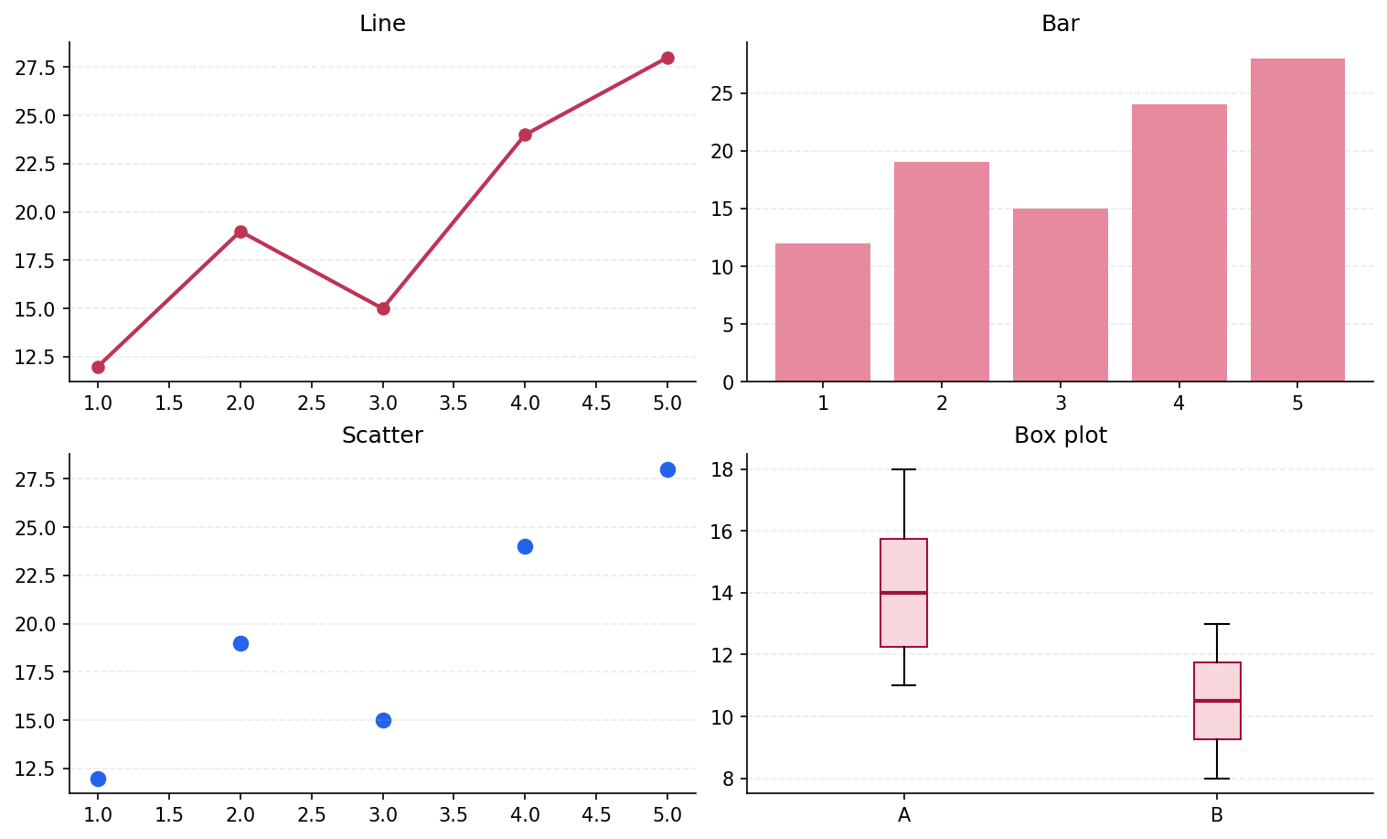
6. Plot Data from CSV or Excel
In practical work, pandas can load a table and pass its columns to Matplotlib.
import pandas as pd
import matplotlib.pyplot as plt

df = pd.read_csv("sales.csv")

fig, ax = plt.subplots(figsize=(7, 4))
ax.plot(df["month"], df["sales"], marker="o")
ax.set_xlabel("Month")
ax.set_ylabel("Sales")
ax.set_title("Monthly Sales")

fig.savefig("sales.png", dpi=150, bbox_inches="tight")
plt.show()
Use pd.read_excel("sales.xlsx") for an Excel workbook.
python -m pip install pandas openpyxldf.head() and df.dtypes before plotting.
7. Customize Titles, Colors, Legends, and Grids
fig, ax = plt.subplots(figsize=(8, 4.5))

ax.plot(
    month,
    sales,
    color="#be3455",
    linewidth=2,
    marker="o",
    label="Sales"
)
ax.set_title("Monthly Sales", fontsize=16)
ax.set_xlabel("Month")
ax.set_ylabel("Sales")
ax.set_ylim(0, 250)
ax.grid(axis="y", linestyle="--", alpha=0.35)
ax.legend()

fig.tight_layout()
For repeated designs, style sheets and rcParams can collect shared defaults instead of repeating every option in each script.
8. Save a Chart as PNG, SVG, or PDF
fig.savefig("chart.png", dpi=300, bbox_inches="tight")
fig.savefig("chart.svg", bbox_inches="tight")
fig.savefig("chart.pdf", bbox_inches="tight")- PNG: convenient for websites, email, and ordinary documents
- SVG: scalable and useful for web or later editing
- PDF: useful for print, papers, and reports
dpi controls raster resolution, while bbox_inches="tight" helps prevent labels from being clipped.
Saving before plt.show() also avoids blank output in some environments.
9. Fix Missing or Square Font Characters
If a label appears as empty squares, the required font may be missing or Matplotlib may not be selecting it.
import matplotlib.pyplot as plt

plt.rcParams["font.family"] = "Noto Sans CJK JP"
plt.rcParams["axes.unicode_minus"] = False10. Common Problems
| Problem | What to check |
|---|---|
| No chart appears | Add plt.show() and check whether the environment has a usable display backend |
| Labels overlap or are clipped | Try layout="constrained", fig.tight_layout(), or bbox_inches="tight" |
| A line jumps backward | Sort the X values, especially dates, before plotting |
| Numeric data plots incorrectly | Use df.dtypes to check whether the column was read as text |
| Characters appear as squares | Install the needed font and select its exact family name |
| Memory grows during batch output | Call plt.close(fig) after saving each Figure |
11. Matplotlib, Excel, or Sakura Chart?
| Tool | Best suited to | Tradeoff |
|---|---|---|
| Matplotlib | Automation, detailed styling, batch output, and integration with Python analysis | Requires code and a Python environment |
| Excel | Cell-level calculation, formulas, pivoting, and visual editing | Repeated chart formatting can take many manual steps |
| Sakura Chart | Pasting an Excel table and quickly selecting columns, colors, and a standard chart without code | Does not provide Matplotlib's code-level freedom |
Matplotlib is the strongest option when automation and reproducibility matter. If you simply need to turn an existing table into a chart without installing Python, a table-first web tool can be faster.
Create a Chart Without Code
With Sakura Chart, paste a table from Excel or a spreadsheet, choose the chart type, columns, and colors, and generate a bar, line, scatter, box, or pie chart in your browser.
Try Sakura Chart for free12. Summary
- Matplotlib creates many types of charts from Python code
fig, ax = plt.subplots()provides a clear structure for reusable plots- Choose
plot,bar,scatter,hist, orboxplotbased on the question savefigexports a Figure as PNG, SVG, PDF, and other formats- Use Matplotlib for automation and flexibility; use Excel or Sakura Chart for a table-first workflow