1. 散布図とは?
散布図(Scatter Plot)は、2つの数値の関係(相関)を視覚的に確認するためのグラフです。 横軸(X軸)と縦軸(Y軸)にそれぞれ別の数値をとり、1つ1つのデータを点としてプロットします。
例えば、次のような場面でよく使われます。
- 製造条件(温度・時間など)と品質指標(寸法・抵抗値など)の関係
- 広告費と売上、勉強時間とテスト点数などの関係
- 年齢と満足度スコアなど、アンケート結果の関係
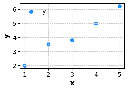
※ あなたのデータを CSV 形式で貼り付けるだけで、同様の散布図を自動生成できます。
2. 散布図で分かること
2-1. 相関の有無と向き
散布図では、点の並び方から相関の有無や向きを判断できます。
- 右上がりに点が並ぶ:片方が増えるともう一方も増える「正の相関」
- 右下がりに点が並ぶ:片方が増えるともう一方は減る「負の相関」
- ばらばらに散らばる:強い相関はなさそう
相関係数だけではイメージしづらい関係性も、散布図なら「どんな並び方をしているか」を直感的に把握できます。
2-2. データの広がりとクラスター
点がどのあたりに集中しているかを見ることで、 「よく現れる組み合わせ」や「典型的な領域」を知ることができます。
- ある範囲に固まっている → 条件がある程度限定されている
- 2つ以上のかたまり(クラスター)がある → グループが混ざっている可能性
2-3. 外れ値の発見
ほとんどの点から大きく離れた点は、外れ値である可能性があります。
- 測定ミスや入力ミス
- 特別な条件でのみ発生したデータ
散布図で外れ値を見つけることで、データの品質確認や、原因調査のきっかけになります。
3. データの準備と列の構成
散布図では、X軸に置く数値とY軸に置く数値を用意します。 桜チャートでは、次のような形式のデータで散布図を描画できます。
3-1. 単純な散布図の例
x,y
1.0,2.0
2.0,3.5
3.0,3.8
4.0,5.0
5.0,6.2
この場合、X軸に x、Y軸に y をとった散布図が描かれます。
3-2. LEVEL列でグループごとに色分けする例
グループごと(条件ごと・ラインごと・製品ごとなど)に色を変えて散布図を描きたい場合は、
LEVEL 列を追加します。
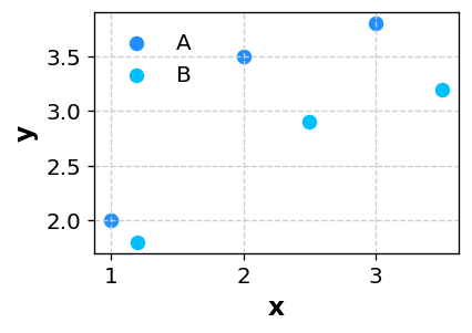
x,y,LEVEL
1.0,2.0,A
2.0,3.5,A
3.0,3.8,A
1.2,1.8,B
2.5,2.9,B
3.5,3.2,B
このように LEVEL を付けておくと、
AグループとBグループが別の色で表示され、グループごとの傾向の違いを直感的に比較できます。
4. 桜チャートで散布図を描く手順
-
Excel やスプレッドシートでデータ(
x列、y列、必要ならLEVEL列)を準備し、データ範囲をコピーします。 - 桜チャートのホーム画面 のテキストエリアに、そのまま貼り付けます。
- 「グラフ作成に進む」ボタンを押し、グラフの種類から Scatter(散布図) を選びます。
-
X軸にしたい列(例:
x)、Y軸にしたい列(例:y)を選択します。 -
LEVEL列がある場合は、グループごとの色分けに使う列として
LEVELを指定します。 - 点の色・サイズ、軸範囲、グリッド線の有無などを必要に応じて調整し、「描画」ボタンでグラフを生成します。
詳しい画面の説明や、他のグラフとの組み合わせ方は 使い方ページ にもまとめています。
4-1. サンプルデータで回帰線を試す
条件Xに対して測定値Yがどう変化するかを、A・Bの2グループで比べる説明用データです。実測データではありません。自分の測定値を入れる前に、設定から出力までの流れを試せます。
- Scatter(散布図)を選び、X列・Y列を指定し、LEVEL列でグループを色分けします。
- 「回帰線(散布図)」で「直線を表示」を選び、「式・R²の表示」を「回帰式とR²」にします。
- 描画すると、LEVELごとに点と同じ色の回帰線が表示されます。グループを別画像に分割した場合も、各グループを個別に回帰します。
期待される結果と読み方
Aはおよそ Y = 1.5X + 0.667、R² = 0.964、Bは Y = 1.5X + 1.333、R² = 0.964 になります。傾きは同じでも、同じXでのBの予測値は約0.667高くなります。全体を1本の線でまとめる前に、グループ別で比較する意味が分かる例です。
傾きは「Xが1増えたときの予測Yの変化」、切片は「X=0での予測Y」です。この例のX=0は観測範囲外なので、実測値のようには扱いません。R²はこの直線がデータのYのばらつきをどの程度説明するかの指標であり、「将来の予測が当たる確率」ではありません。
結果をそのまま資料に使う
PNG・Excel・PowerPointには、回帰線・式・R²を含むグラフ画像を出力できます。Office上のグラフ本体は画像であり、Officeの編集可能なネイティブグラフではありません。Excelでは元データや選択した統計量・集計条件も確認できます。
結果を判断に使う前の注意点
- R²が高くても因果関係は証明できません。3点は操作例にすぎないため、判断には観測数を増やし、外れ値や曲線的な関係も確認してください。
- 欠損・数値でない組は除外します。有効な点が2点未満、またはXがすべて同じ場合は回帰できません。Yが一定ならR²はN/Aです。
- 対数軸でも元の値を使う直線回帰であり、対数変換後の回帰ではありません。対数軸の0以下の値は除外します。信頼区間・予測区間の表示機能はありません。
5. どんなときに散布図を使うと良いか
- 「条件Aを変えると、結果Bがどう変わるか?」を確認したいとき
- 相関係数の数値だけでなく、実際の点の並び方も見たいとき
- 製造条件と品質特性の関係を検証したいとき
- アンケートで得た2つの数値(年齢と満足度など)の関係を確認したいとき
- 機械学習や回帰分析の前に、データの傾向をざっくり把握したいとき
散布図は、「2つの数値の間に関係がありそうか」を確かめる最初の一歩として、とても強力なグラフです。
6. まとめ
- 散布図は、2つの数値の関係(相関)を点の配置で表現するグラフ
- 点の並びから、相関の有無・向き・強さのイメージをつかめる
- X・Y・LEVELといった列を用意すれば、桜チャートで簡単に散布図を作成できる
- 外れ値の発見や、クラスター構造の把握にも役立つ
「2つの数値の関係を視覚的に確認したい」と感じたら、まず散布図を試してみてください。 桜チャート を使えば、データを貼り付けて数クリックするだけで、 プレゼンやレポートにそのまま使える散布図を作成できます。