1. 折れ線グラフとは?
折れ線グラフ(Line Chart)は、時間の経過や 連番に沿った値の変化を、点と線で表現するグラフです。 データの「増えているのか・減っているのか」「どのタイミングで変化したのか」を 直感的に確認できます。
代表的な利用シーンとしては、次のようなものがあります。
- 日別・月別の売上推移
- 生産数量や良品率の経時変化
- 温度・圧力・電流値などの時系列測定
- テストスコアや評価指標の推移
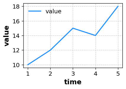
※ あなたのデータを CSV 形式で貼り付けるだけで、同様の折れ線グラフを自動生成できます。
2. 折れ線グラフで分かること
2-1. 時間経過によるトレンド
折れ線グラフの一番の強みは、時間経過によるトレンドを把握しやすいことです。
- 右肩上がり:値が全体として増加している
- 右肩下がり:値が全体として減少している
- 周期的な波形:季節性やサイクルがある
こうした傾向を視覚的に確認することで、「この期間は調子が良かった」「このあたりで大きな変化があった」 などをすぐに把握できます。
2-2. 変化のタイミング・スピード
線の傾きが急な部分は、短期間で大きな変化が起きていることを意味します。 改善施策を打ったタイミングや、トラブルが発生したタイミングと重ねることで、 「何が原因で変化したのか」を考える手がかりになります。
2-3. 複数系列の比較
折れ線グラフでは、複数の系列(ライン)を重ねることで、 グループ間・条件間の推移の違いを比較できます。
- ラインAとラインBで、どちらが常に高いか
- 途中で追いついた/逆転したポイント
- 変動の激しさの違い
表だけでは伝わりにくい違いも、折れ線グラフにすると一目で伝えられます。
3. データの準備と軸の置き方
折れ線グラフでは、X軸=時間や連番、Y軸=値として データを用意するのが基本です。桜チャートでは、次のような形式のデータを用意すれば折れ線グラフを描けます。
3-1. 単一系列の例
time,value
1,10
2,12
3,15
4,14
5,18
この場合、X軸に time、Y軸に value をとった折れ線グラフが1本描画されます。
time は「1,2,3...」のような連番でも、「2025-01-01」などの日付でも構いません。
3-2. LEVEL列で系列を分ける例
条件ごと・グループごとに複数のラインを描きたい場合は、
LEVEL という列を追加します。
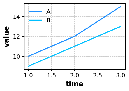
time,value,LEVEL
1,10,A
2,12,A
3,15,A
1, 9,B
2,11,B
3,13,B
このように LEVEL を付けておくと、
A系列・B系列の2本のラインを、同じグラフ上に描画できます。
4. 桜チャートで折れ線グラフを描く手順
-
Excel やスプレッドシートでデータ(
time列とvalue列、必要ならLEVEL列)を準備し、データ範囲をコピーします。 - 桜チャートのホーム画面 のテキストエリアに、そのまま貼り付けます。
- 「プレビューへ」ボタンを押し、グラフの種類から Line(折れ線グラフ) を選びます。
-
X軸にしたい列(例:
time)、Y軸にしたい列(例:value)を選択します。 -
LEVEL列がある場合は、系列のグループ分けに使う列として
LEVELを指定します。 - 線の色や太さ、マーカーの有無、軸範囲などを必要に応じて調整し、「描画」ボタンでグラフを生成します。
各項目の詳細や、他のグラフ種類との違いは 使い方ページ にもまとめています。
5. どんなときに折れ線グラフを使うと良いか
- 日次・月次の売上やアクセス数の推移を示したいとき
- ラインごとの生産数や歩留まりの変化を追いたいとき
- 温度・圧力・電流などの時系列データをまとめたいとき
- 施策前後での変化を、グラフで分かりやすく見せたいとき
- 論文やレポートで、経時変化を示す図が必要なとき
折れ線グラフは、「いつ、どのくらい変化したか」を伝えるのが得意です。 時間軸に沿って変化を見る必要があるデータには、まず折れ線グラフを候補にしてみるのがおすすめです。
6. まとめ
- 折れ線グラフは、時間や連番に沿った値の推移を表現するグラフ
- トレンド・変化のタイミング・複数系列の比較がしやすい
- X軸=時間(または連番)、Y軸=値、LEVEL列で系列分けすると扱いやすい
- 桜チャートなら、データを貼り付けて列を選ぶだけで折れ線グラフを作成できる
「時間とともにどう変化しているか」を伝えたいときは、ぜひ折れ線グラフを使ってみてください。 桜チャート を使えば、コードを書かなくても統計グラフを素早く作成できます。