1. 棒グラフとは?
棒グラフ(Bar Chart)は、カテゴリごとの大きさ・数値を、 棒の長さ(高さ)で表現するグラフです。項目ごとの値を比較したいときに最もよく使われます。
例えば、次のようなデータを見せるのに向いています。
- 製品別の売上金額
- 部署ごとの人数・残業時間
- ラインごとの生産数量・歩留まり
- アンケートの回答数(「はい」「いいえ」など)
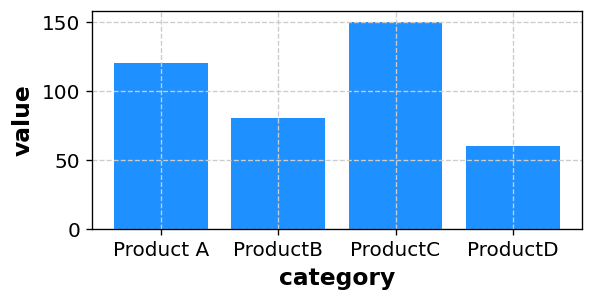
※ あなたのデータを CSV 形式で貼り付けるだけで、同様の棒グラフを自動生成できます。
2. 棒グラフで分かること
2-1. カテゴリ間の大小関係
棒グラフの一番の利点は、カテゴリ間の大小関係がひと目で分かることです。
- どの項目の値が最も大きいか/小さいか
- 二つの項目の差がどれくらいあるか
- 上位と下位のグループがどこで分かれるか
数値の表だけを見ていると直感的に掴みにくい違いも、 棒グラフにするとすぐに理解できます。
2-2. 変化の比較(棒グラフ+時間軸)
X軸に時間、Y軸に値をとって棒グラフを描くと、 「折れ線グラフほど細かいトレンドは追わないが、期間ごとの大きさを比較したい」 といった用途に使えます。
- 月ごとの売上を比較するとき
- 年ごとの生産量をざっくり比べたいとき
2-3. 複数グループの比較
棒グラフでは、カテゴリ × グループ(例えば「製品 × 地域」)のように、 二つの観点を掛け合わせた比較も可能です。
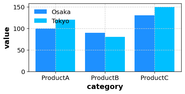
桜チャートでは、LEVEL 列を使うことで「グループ化された棒グラフ」も描画できます。
3. データの準備と列の構成
棒グラフでは、基本的に「カテゴリ(X軸)」と「値(Y軸)」を用意します。 桜チャートでは、次のような形式のデータから棒グラフを作成できます。
3-1. 単純な棒グラフの例
category,value
Product A,120
ProductB,80
ProductC,150
ProductD,60
この場合、X軸に category、Y軸に value をとった棒グラフが描かれます。
「Product A~D」の比較が一目で分かるグラフになります。
3-2. LEVEL列でグループ化した棒グラフの例
地域別・年度別など、複数のグループを並べて比較したい場合は、
LEVEL 列を加えます。
category,value,LEVEL
ProductA,120,Tokyo
ProductB, 80,Tokyo
ProductC,150,Tokyo
ProductA,100,Osaka
ProductB, 90,Osaka
ProductC,130,Osaka
このように LEVEL を付けておくと、
「Tokyo」と「Osaka」の棒を並べたグラフとして描画し、
地域ごとの違いを比較できます。
4. 桜チャートで棒グラフを描く手順
-
Excel やスプレッドシートで、
category列とvalue列(必要ならLEVEL列)を含む表を作成し、データ範囲をコピーします。 - 桜チャートのホーム画面 のテキストエリアに、そのまま貼り付けます。
- 「プレビューへ」ボタンを押し、グラフの種類から Bar(棒グラフ) を選びます。
-
X軸として使う列(例:
category)、Y軸として使う列(例:value)を選択します。 -
LEVEL列がある場合は、グループごとに棒を分けたいときに
LEVEL列を指定します。 - 棒の色・幅、ラベルの表示、軸範囲などを必要に応じて調整し、「描画」ボタンでグラフを生成します。
桜チャートでは、縦棒・横棒・積み上げ棒グラフなど、 複数のバリエーションを用意しています。詳細は 使い方ページ もご覧ください。
5. どんなときに棒グラフを使うと良いか
- カテゴリごとの値を比較したいとき(製品別・部署別・ライン別など)
- 年度別・地域別など、複数のグループを見比べたいとき
- 円グラフよりも、正確な差をはっきり見せたいとき
- 報告書やプレゼンで、数値の違いをシンプルに伝えたいとき
円グラフが「構成比のイメージ」を伝えるのに向いているのに対し、 棒グラフは「どちらがどれだけ大きいか」を明確に示せるのが強みです。
6. まとめ
- 棒グラフは、カテゴリごとの値を棒の長さで表現するグラフ
- カテゴリ間の大小関係や差を分かりやすく伝えられる
- category・value・LEVELといった列を用意すれば、桜チャートで簡単に作成できる
- 構成比をざっくり示したいときは円グラフ、差をハッキリ見せたいときは棒グラフがおすすめ
「どの項目がどれくらい違うのか」を伝えたいときは、まず棒グラフを検討してみてください。 桜チャート を使えば、データを貼り付けて数クリックするだけで、 資料にそのまま使える棒グラフを作成できます。