1. 箱ひげ図とは?
箱ひげ図(Box Plot)は、データの 「分布の広がり」や「ばらつき」「外れ値」 を一枚の図で確認できる統計グラフです。 平均値だけでは分かりにくい、データの「散らばり具合」や「偏り」を直感的に把握できます。
ひとつの箱ひげ図の中には、主に次の情報が含まれます。
- データの中心(中央値)
- 真ん中50%のデータ範囲(第1四分位~第3四分位)
- 通常の範囲における最小値・最大値
- それらから外れたデータ(外れ値)

※ あなたのデータを CSV 形式で貼り付けるだけで、同様の箱ひげ図を自動生成できます。
2. 箱ひげ図で分かること
2-1. データのばらつき(四分位範囲)
箱の上下は、それぞれ 第1四分位数(25%地点) と 第3四分位数(75%地点) を表します。 この範囲(IQR:Interquartile Range)が広いほど、 「データのばらつきが大きい」と解釈できます。
2-2. 中心の位置(中央値)
箱の中に引かれた太い線は 中央値 を表します。 箱の中央からずれていれば、データが片側に偏っている可能性があります。 複数のグループを並べたときは、この線の高さを比べることで 「どのグループの値が高いか・低いか」を直感的に見比べられます。
2-3. 外れ値の有無
箱と「ひげ」の範囲から大きく外れた点は 外れ値 としてプロットされます。
- 計測ミス・入力ミスが紛れ込んでいないか
- 特別な条件で発生したデータではないか
といった観点で、外れ値を確認するきっかけになります。
3. データの準備と軸の置き方
箱ひげ図では、通常「Y列の値の分布」を可視化します。 桜チャートでは、次のような形式のデータを用意すれば箱ひげ図を描けます。
3-1. 単一グループの例
value
12
15
18
20
17
16
22
この場合、1つのデータ列 value の分布を表す箱ひげ図が描画されます。
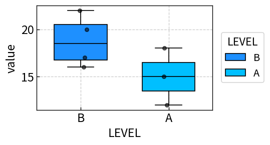
3-2. LEVEL列でグループごとに比較する例
グループごとの分布を比較したい場合は、
LEVEL という列を追加します。
value,LEVEL
12,A
15,A
18,A
20,B
17,B
16,B
22,B
このように LEVEL を付けておくと、
Aグループ・Bグループを並べて箱ひげ図を描画できます。
4. 桜チャートで箱ひげ図を描く手順
-
Excel やスプレッドシートでデータ(
value列、必要ならLEVEL列)を準備し、データ範囲をコピーします。 - 桜チャートのホーム画面 のテキストエリアに、そのまま貼り付けます。
- 「プレビューへ」ボタンを押し、グラフの種類から Box(箱ひげ図) を選びます。
-
Y軸にしたい列(例:
value)を選択します。 LEVEL列がある場合は、グループ分けに使う列としてLEVELを指定します。 - 線の太さや色、軸範囲などを必要に応じて調整し、「描画」ボタンでグラフを生成します。
より詳しい画面の説明や、他のグラフ種類との使い分けは 使い方ページ もあわせてご覧ください。
5. どんなときに箱ひげ図を使うと良いか
- クラス・部署・ラインごとの成績・品質分布を比較したいとき
- センサー値や測定値に外れ値が混ざっていないか確認したいとき
- 平均値だけでは見えない「ばらつき」の違いを示したいとき
- 論文やレポートで、グループ間の分布比較を図で分かりやすく示したいとき
同じ平均値でも、箱ひげ図で見ると 「あるグループはばらつきが大きい」「あるグループは安定している」といった 違いがはっきり見えてきます。
6. まとめ
- 箱ひげ図は、分布の広がり・偏り・外れ値を1枚で示せるグラフ
- 中央値と四分位範囲を見ることで、データの中心とばらつきを把握できる
- LEVEL列を使えば、複数グループの分布を簡単に比較できる
- 桜チャートなら、CSVを貼り付けて列を選ぶだけで箱ひげ図を作成できる
「平均値だけでは不安だな……」と感じたら、ぜひ箱ひげ図を試してみてください。 桜チャート を使えば、面倒な設定なしで統計グラフを素早く作成できます。