1. 円グラフとは?
円グラフ(Pie Chart)は、全体を1つの円として100%とみなし、 その中をいくつかの「扇形」に分けて割合・構成比を表現するグラフです。
「どの項目がどれくらいの比率を占めているか」を直感的に伝えたいときに便利で、 報告書やプレゼン資料でもよく使われます。
- 売上の内訳(製品別・地域別など)
- アンケート結果の回答割合
- 時間の使い方・コスト構成比
- エネルギー源や材料の構成比

※ あなたのデータを CSV 形式で貼り付けるだけで、同様の円グラフを自動生成できます。
2. 円グラフで分かること
2-1. 各項目の構成比
円グラフでは、各扇形の角度と面積が割合(%)を表します。 扇形が大きいほど、その項目が全体に占める比率が高いことを意味します。
- どの項目が一番大きな比率を占めているか
- 2番目・3番目に大きい項目は何か
- ほとんど影響の小さい項目はどれか
2-2. 全体に対するイメージ
棒グラフに比べると、円グラフは「厳密な値」よりも、 だいたいのバランス感を伝えるのが得意です。
レポートやスライドでは、詳細な数値は表に任せ、 円グラフは「全体のイメージを一枚で見せる」用途に使われることが多いです。
2-3. 注意点:項目が多すぎる場合
円グラフは、項目数が多すぎると逆に読みにくくなります。
- 5~6項目程度までに絞ると、パッと見で理解しやすい
- 小さな項目は「その他」とまとめるのも有効
- 割合が近い項目同士は、棒グラフの方が比較しやすい場合もある
「構成比をざっくり見せたい」のか、「正確な差を比較したい」のかで、 円グラフと棒グラフを使い分けるのがおすすめです。
3. データの準備と列の構成
円グラフでは、基本的に「カテゴリ」と「値」の2種類の情報を用意します。 桜チャートでは、次のような形式のデータで円グラフを描けます。
3-1. シンプルな円グラフの例
label,value
Japan,50
NorthAmerica,25
Europe,15
Others,10
この場合、label 列が扇形のラベル、
value 列が割合のもとになる値になります。
桜チャート側で自動的に合計を100%として扱い、比率を計算します。
3-2. 年度ごとに列を分けて、円グラフを比較する例
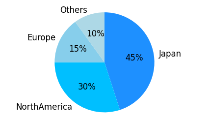
「2024年」と「2025年」で構成比がどう変わるかを比較したい場合、 次のように年度ごとに列を分けると分かりやすくなります。
label,2024,2025
Japan,50,45
NorthAmerica,25,30
Europe,15,15
Others,10,10
このように列を分けておくと、
- 2024列を「値」の列として選べば「2024年の構成比の円グラフ」
- 2025列を「値」の列として選べば「2025年の構成比の円グラフ」
というように、同じカテゴリ(label)を使ったまま、
年度ごとの構成比の違いを2枚の円グラフで比較できます。

4. 桜チャートで円グラフを描く手順
-
Excel やスプレッドシートで、
label列と 「値」として使いたい列(例:valueや2024,2025)を含む表を作成し、データ範囲をコピーします。 - 桜チャートのホーム画面 のテキストエリアに、そのまま貼り付けます。
- 「プレビューへ」ボタンを押し、グラフの種類から Pie(円グラフ) を選びます。
-
「ラベル列」として使う列(例:
label)と、 「値」として使う列(例:valueまたは2024)を選択します。 - 2024年と2025年を比較したい場合は、 一度 2024 列を選んで円グラフを作成し、次に 2025 列を「値」として選び直して、もう一度円グラフを作成します。
- 色のカスタマイズや、割合ラベルの表示/非表示などを調整し、「描画」ボタンで円グラフを生成します。
画面ごとの説明や細かなオプションは、 使い方ページ にまとめています。
5. どんなときに円グラフを使うと良いか
- 売上やコストの内訳をざっくり示したいとき
- アンケート結果のシェア(例:賛成・反対・どちらともいえない)を見せたいとき
- 時間やリソースがどの活動にどれだけ割かれているか示したいとき
- プレゼン資料で、全体の構成イメージを一枚で伝えたいとき
一方で、「AとBの差が何ポイントか」といった細かな比較には、 円グラフよりも棒グラフの方が適している場合もあります。 目的に応じて、グラフを使い分けてみてください。
6. まとめ
- 円グラフは、全体に対する各項目の割合・構成比を示すグラフ
- 「どの項目がどれくらいの比率か」を直感的に伝えたいときに便利
- カテゴリ列と値の列を用意すれば、桜チャートで簡単に円グラフを作成できる
- 年度別などを比較したいときは、列を分けて複数の円グラフとして描くと分かりやすい
- 項目が多すぎる場合や細かな比較が必要な場合は、棒グラフなど他のグラフも検討する
「内訳を分かりやすく見せたい」と感じたら、まずは円グラフを試してみてください。 桜チャート を使えば、データを貼り付けて数クリックするだけで、 資料にそのまま使える円グラフを作成できます。