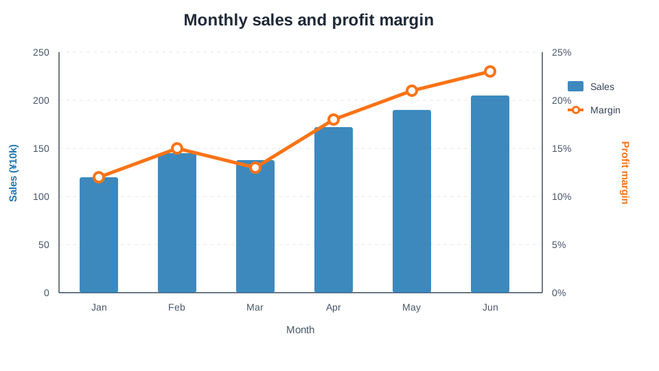
A combination chart places two chart forms, such as bars and a line, in the same figure.
It is useful when you want to compare two metrics that share the same categories or time periods but use different units or scales.
If monthly sales and profit margin are shown in separate charts, the reader must move back and forth between them.
Showing sales as bars and margin as a line makes it easier to see whether margin improved during the months when sales increased.
Sales on the primary axis and profit margin on the secondary axis
Sakura Chart lets you choose bar or line, primary or secondary axis, and a color for each series.
2. Data That Works Well in a Combination Chart
Combination charts are helpful when several metrics were measured for the same periods or categories and you want to examine them together.
Bar series
Line series
Question to explore
Sales
Profit margin
How revenue and profitability changed together
Production volume
Yield
Whether quality was maintained as output increased
Advertising spend
Conversion rate
How investment and outcome rate changed
Precipitation
Average temperature
How monthly weather conditions overlapped
Inspection count
Defect rate
How workload and defect frequency moved
If the series have similar units and ranges, plotting them on one shared axis is often easier to compare.
Do not add a secondary axis simply because there are two series; use it when one series would otherwise become difficult to read.
3. Reading the Primary and Secondary Axes
A dual-axis combination chart has a different scale on each side.
In Sakura Chart, the left side is the primary axis and the right side is the secondary axis.
Primary axis (left): often used for quantities such as sales, units produced, or headcount.
Secondary axis (right): useful for a rate, percentage, temperature, or another metric with a different unit.
Axis labels: state both the metric and unit, such as “Sales (¥10k)” and “Profit margin (%).”
A secondary axis must be handled carefully. Changing the minimum and maximum values can make two series appear strongly connected or almost unrelated.
Keep both scales legible and avoid aggressively narrowing an axis without a clear explanation.
4. Preparing Your Data
Put the shared X-axis in one column and each numeric series in its own column.
You can copy a table directly from Excel or a spreadsheet and paste it into Sakura Chart.
In this example, select Month for X, Sales as bars on the primary axis,
and Profit margin as a line on the secondary axis.
Units can also be included in the column names.
5. How to Create a Combination Chart with Sakura Chart
Select the series to use, then choose its color, bar or line form, and primary or secondary axis.
If needed, set the title, axis labels, axis limits, gridlines, and opacity.
Select “Create combination chart” and review the result.
Use “Save image” to download the finished PNG.
After the initial column analysis, the first numeric series is preselected as bars on the primary axis and the next as a line on the secondary axis.
You can change every series setting to match your analysis.
6. Design Tips for a Clear, Honest Chart
6-1. Give Bars and Lines Different Roles
Bars work well for absolute quantities, while a line works well for a rate or trend.
Assigning a clear role to each form helps readers distinguish the series.
6-2. Connect Colors, Labels, and Axes
Use clearly different series colors and check the legend and both axis labels.
Limiting the chart to the two or three most important series usually produces a cleaner result.
6-3. Start a Bar Axis at Zero in Most Cases
Bar length is read as magnitude. Starting the axis far above zero can exaggerate differences, so zero is the normal baseline unless there is a specific reason to do otherwise.
6-4. Similar Movement Does Not Prove Causation
Two series moving together does not prove that one caused the other.
A combination chart can reveal a pattern worth investigating, but it cannot establish the cause by itself.
7. When Not to Use a Combination Chart
When the chart would require three or more different units
When too many bars and lines overlap
When the metrics do not need to be compared directly
When the apparent conclusion changes dramatically with small axis adjustments
When the chart becomes crowded, use two vertically aligned charts with a shared X-axis instead.
8. Summary
A combination chart compares different metrics that share one X-axis.
Bars are effective for quantities, while a line is effective for a rate or trend.
Use primary and secondary axes when the units or scales differ.
Label both axes clearly and choose ranges that do not mislead the reader.
In the Sakura Chart Combination Chart tool,
paste your data and choose the form and axis for each series.
Try it with sales and margin, production and yield, or another pair from your own data.