A contour plot shows a measured value Z across X-Y coordinates using filled colors and contour lines.
Just as a topographic map connects locations at the same elevation, a contour plot connects locations with the same temperature, concentration, pressure, or other value.
It preserves spatial relationships while revealing high regions, low regions, and steep boundaries that are difficult to spot in a table.
Unlike a simple grid heatmap, the data points do not need to form a perfectly regular grid: the surface can be interpolated from triangles built between coordinates.
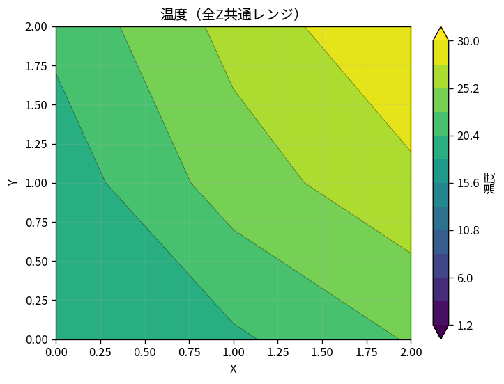
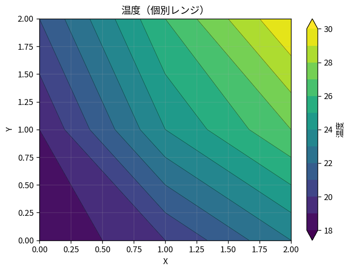
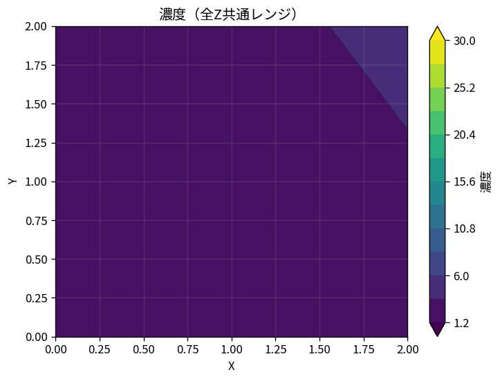
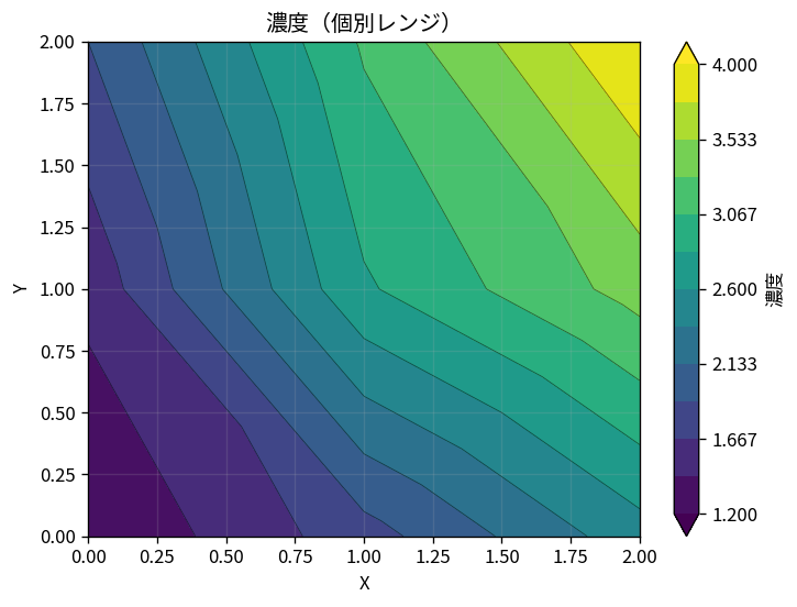
The visible pattern changes when the color range changes
2. Where Contour Plots Are Used
A contour plot works well when X and Y represent location and Z is a value measured at that location.
Field
Example X-Y coordinates
Example Z value
Purpose
Manufacturing and quality
Position on a wafer or substrate
Film thickness, resistance, defects
Find within-surface variation
Chemistry and experiments
Position in a vessel
Concentration, pH, temperature
See diffusion or reaction patterns
Weather and environment
Longitude and latitude
Temperature, rainfall, pollution
Locate high and low regions
Mechanical and fluid systems
Position on a part or in a flow path
Pressure, velocity, stress
Find concentrations and gradients
Topography
East-west and north-south position
Elevation or depth
Identify hills, valleys, and slopes
3. Preparing X, Y, and Z Data
Use one row for each measurement point and separate the X coordinate, Y coordinate, and measured Z value into columns.
You can include several Z columns and select more than one in Sakura Chart.
Here, X and Y are positions, while Temperature and Concentration are Z columns.
At least three distinct coordinates with valid numeric values are required.
The points must also span an area; three points on a single straight line cannot form a surface.
4. Shared Range vs. Individual Range
For every selected Z column, Sakura Chart creates both a shared-range and an individual-range image.
Each view answers a different question.
4-1. Shared Range Across All Z Columns
All selected Z columns use the same color minimum and maximum.
Because the same color represents the same numeric value, this view supports a fair comparison of absolute values across conditions, such as before and after processing.
If the selected columns have very different ranges, however, variation in the smaller series may be compressed into almost one color.
4-2. Individual Range
Each Z column uses its own minimum and maximum.
This makes small gradients and within-series patterns easier to see.
The tradeoff is that the same color can represent a different value in each image.
Do not compare absolute values by color alone; read each color bar.
Question
Best view
Which Z column has higher absolute values on the same scale?
Shared range
What small spatial variation exists inside each Z column?
Paste CSV or TSV data with one measurement point per row, then select “Load columns.”
Choose the X-coordinate and Y-coordinate columns.
Select one or more Z columns to plot.
If needed, set the individual Z minimum and maximum, contour count, colormap, and opacity.
Select “Create contour plots.”
Compare the shared and individual ranges for every Z column and save the images you need.
Leave the individual minimum and maximum blank to use each Z column's own range automatically.
The contour count can be set from 3 to 40.
6. Choosing the Contour Count and Colormap
6-1. Contour Count
More levels create a smoother-looking plot, but they do not add real information when the dataset has only a few measurement points.
Start near the default of 12 and increase it only if the steps look too coarse.
6-2. Colormap
Viridis or Cividis: good general choices for values progressing from low to high.
Plasma, Inferno, or Magma: useful when you want a stronger difference in brightness.
Coolwarm: helpful for values moving in two directions around a meaningful reference.
Turbo or Jet: visually vivid, but color boundaries may appear stronger than the underlying change, so read them with the color bar.
When comparing several plots, keep both the range and colormap consistent.
7. Important Reading Cautions
7-1. Color Boundaries Are Interpolated
Values between measurement points are estimated.
If abrupt changes are physically possible, collect more measurements or compare the plot with the original data.
7-2. Measurement Density Matters
Estimates are less certain in sparse areas than in densely sampled areas.
When possible, plan measurements with reasonably even coverage across X and Y.
7-3. The Plot Covers the Area Enclosed by the Points
Sakura Chart builds triangles between measurement points, so the plot generally visualizes the area enclosed by them.
Do not assume the same pattern continues beyond the measured region.
7-4. Read the Color Bar, Not Color Alone
Especially in individual-range plots, the same yellow may not mean the same number.
Always interpret color together with its numeric scale.
8. Summary
A contour plot represents Z values over X-Y coordinates with colors and contour lines.
It is useful for surface distributions such as temperature, concentration, thickness, and pressure.
Use a shared range to compare Z columns and an individual range to inspect small variation within each column.
Remember that the surface is interpolated, and review the measurement layout and color bar.
The Sakura Chart Contour Plot tool
creates shared- and individual-range views after you choose X, Y, and one or more Z columns.
Try it with experimental measurements or another spatial dataset.